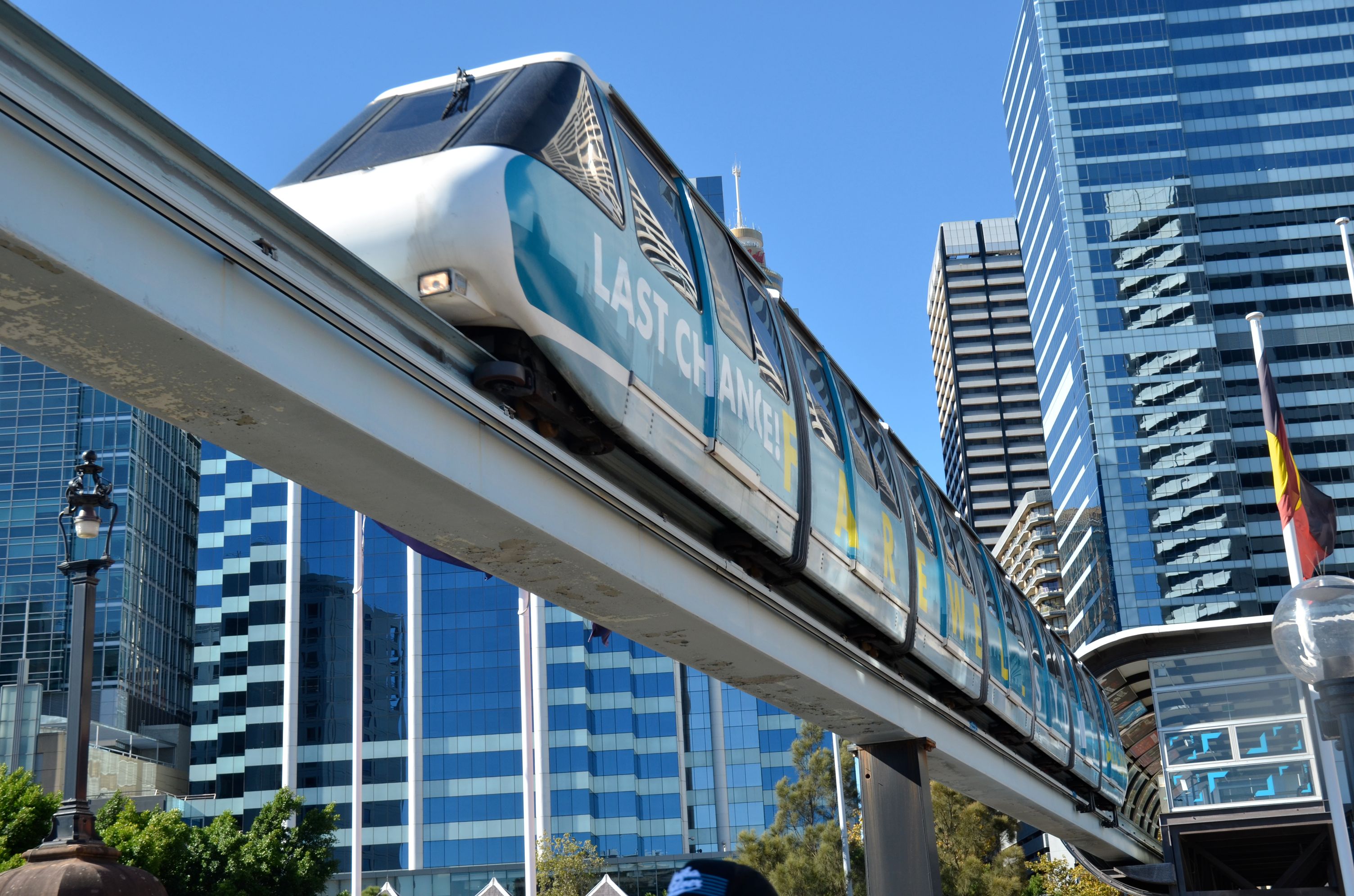
About half a year ago, I launched the Opal or Not website that compares the fares of Sydney’s new Opal transit smartcard and the paper tickets it replaces. As I’d hoped, this quickly went viral, bringing attention to Opal’s hidden costs and ending up in the Sydney Morning Herald.
Now getting my mug in the SMH is all well and good, but my end goal was to “make Transport for NSW to come up with a saner fare scheme”. Instead, TfNSW sent me a rather bizarre good cop/bad cop letter telling me to they’d love to cooperate, but implying they will sue me if I don’t stop using the Opal logo. When I offered to play ball, changing the logo as a token of good faith, they sent me a 26-page report about all the things with my site that they were unhappy with; quite handy, as you’ll see later, but not exactly the kind of action I was hoping for.
Meanwhile, as they prattled on about how they’re committed to transparency yadda yadda, another arm of the same bureaucracy has been steadfastly stonewalling my request for a copy of that 7% report. At time of writing, after half a year of increasingly absurd effort, they have yet to confirm in writing that the “7%” report they keep talking about even exists. And maybe it doesn’t, because in other places they claim the figure is 4%!
Well, fine. If TfNSW is not going to release their report, based on their vague projections, I’m going to write my own report, based on the cold hard data of the over 130,000 fare comparisons made on the site. And here it is.
The short version
|
Who will pay more with Opal? |
Cost of Opal to Sydney commuters? |
| Transport for NSW report |
4%? 7%? [citation needed] |
They’re not telling |
Opal or Not report, model A: optimal tickets
|
61% [1] |
$98 million/year [1] |
Opal or Not report, model B: estimated tickets
|
26% [1] |
$54 million/year [1] |
Here’s how you can help fix this.
The long version

Now there’s two basic requirements for Opal or Not’s data for it to be of any use: it has to be representative, and it has to be correct.
So the first question is, are the 130,000+ fare comparisons made on Opal or Not a representative sample of the Sydney commuter, instead of (say) an escapist chimpanzee recalculating his fare from Taronga Zoo to Bondi over and over again? In terms of sheer sample size, it should certainly qualify: 812,000 people use Sydney’s public transport on an average weekday, so even if we discount every other comparison, we’re reaching a good tenth or so. For comparison, the Bureau of Transport Statistics Household Travel Survey 2011/12 (HTS) is based on the survey responses of about 3,000 households.
A more useful comparison of the quality, though, is to compare Opal or Not’s mode distribution against the HTS. This isn’t entirely straightforward, since Opal or Not compares door-to-door ‘journeys’ (eg. bus & train) while HTS counts single ‘trips’, but by making the not unreasonable assumption that a bus & train journey equals one bus trip plus one train trip, we get a 70/26/4% split for train/bus/ferry, while HTS has 59/37/4%. This is unsurprising, since Opal for buses remains very much a work in progress, but it does skew the results a bit since the average train commuter loses more from Opal (an extra $65 a year, to be precise) than the average bus commuter. Long story short, if we adjust the mode split to match the HTS, this shaves $5.7m off the paper advantage.
“But wait”, I hear you say, “even if the sample population is representative, what if the calculation itself riddled with errors”? To make sure all potential problems are covered, I’m going to go through TfNSW’s llst of 18 “issues” with the site and analyze their impact on the results one by one. You might want to a brew a stiff coffee before you read on.
1. Incorrect fares shown for some train journeys
Opal or Not computes train distance bands based on actual distance, not wacky-world fare distance, which can throw off estimates by a few km. This means that users whose trip lengths are right on a fare boundary (10 km, 25 km, etc) may be quoted fares for the wrong fare band.
However, Opal and MyTrain bands are defined identically by distance. This means that, even if a user is quoted the wrong zone, they are quoted the correct fares for those zones, and the comparison is thus fair. No adjustment needed.
2. Train journeys that cannot be calculated
There are some cases where the underlying Google Directions API only offers buses, because they’re much faster, so Opal or Not cannot estimate the train distance. But if the site can’t calculate the route, it can’t get the comparison wrong either. No adjustment needed.
3. Incorrect morning peak times for Intercity trains
Opal or Not assumes that morning peak is always 7am to 9am, when it’s actually 6am to 8am when traveling from Intercity stations. However, the website does not ask for exact times, it only asks for time bands, so the relatively few users affected can self-adjust.
But yes, those who do enter 6:30 Intercity trip as “before 7 AM” will get quoted an off-peak Opal fare when they should be paying a peak fare. Since there are more of these people than there are 8:30 Intercity travellers who get quoted peak for off-peak, the net effect of the error is in Opal’s favor: the true cost of Opal is higher.
4. Weekend off-peak fares not included
Opal or Not does not implement train off-peak fares all day on Saturday (or Sunday) for either Opal or paper tickets, instead applying the weekday off-peak rules. This has two effects:
- Peak period travel on Saturday is incorrectly calculated at weekday peak fares. This inflates the cost of both Opal and paper equally, producing no net effect.
- Off-peak travel is calculated with weekday off-peak periods. This gives an unfair advantage to Opal, since this grants ~26% of travelers the discount, vs. ~16% for paper travel. (The actual figure is, of course, 100%.)
All told, the net effect is again in Opal’s favor.
5. Description of MyBus and MyFerry tickets as zonal
This is a wording quibble: MyBus and MyFerry tickets are based on distance travelled, and strictly speaking should not be called “zones”, since that usually implies geographical areas. (By comparison, MyMulti is a true zonal ticket.) Fair enough, but obviously no impact on fares.
6. Change in method of calculating bus fares
The website currently assumes that that MyBus sectors map one-for-one to Opal’s distance-based fares, which is not the case. However, without access to the exact sector data, which TfNSW does not make public, it’s not possible to compute what difference this makes in practice. Opal claims some fares will be cheaper, but the SMH has some cases of people whose fares nearly double, and as we know, while TfNSW probably has their own estimates for this, they refuse to release them. I’ll give them the benefit of the doubt and call it a draw: no impact.
7. Incorrect MyMulti ticket recommended for some journeys
Opal or Not’s determination of what MyMulti ticket to use combines bus and train distance bands, meaning issues 1 and 6 (train and bus distances) apply and users may be quoted the incorrect MyMulti zone. Again, since there is no systemic bias in either direction, this alone does not bias results.
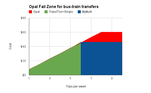
 There is, however, one important source of error in the MyMulti calculations: they assume that train fares bands map directly to MyMulti zones. This is correct for trips originating or terminating from the CBD, but will incorrectly compare to a MyMulti 1 for someone traveling from (say) Blacktown to Parramatta, actually MyMulti 2. The diagram to the left attempts to demonstrate this, with the top ‘ovals’ representing how Opal or Not calculates trip costs and the underlying colored bands showing how the actual MyMulti zones apply. The bits marked “+1/2” show undercharging, whereas “-1/2” shows overcharging: for example, somebody traveling from Hurstville to Parramatta would have been computed as MyMulti 3, when actually a MyMulti 2 would suffice.
We can attempt to correct for the error by applying the known distribution of train travel distances to major destinations in and out of the CBD (both courtesy the Compendium of Sydney Rail Travel Statistics, 8th Edition, RTS), times the number of train travellers using MyMultis and finally the cost incurred (or saved) from using the wrong MyMulti zone. The math is fairly hairy and makes a few rather generous assumptions (eg. that each station’s patronage follows the general distance distribution and that the Inner Sydney statistical area is close enough to the rail CBD fare zone), but because the under- and overcharging tend to balance out, the net effect is fairly minor: $300k off paper tickets.
For completeness, I’ll note that the same issue theoretically applies to ferries. However, since ferries are a relatively minor form of transport and the overwhelming majority of ferry travel is to/from the CBD, the approximation used by the website is more than good enough for our purposes: Ferry 1 = MyMulti 2, Ferry 2 = MyMulti 3.
8. No provision for customers with complex travel patterns
Opal or Not is not a general-purpose fare calculator, but a single-purpose tool geared solely at making it easy to check how Opal will affect the cost of your commute. Per the HTS (Table 4.3.3), we know that commuting to work and school/uni account for the vast majority of public transport usage, so this means the results also represent the vast majority of Sydney’s public transport users. And once again, if the site doesn’t support a given travel pattern, then it’s not giving inaccurate results, it just doesn’t support it. No adjustment needed.
9. No consideration of the customer’s current ticket
 TfNSW, and quite a few of my readers, think it “unfair” to compare Opal to monthly or quarterly tickets, for two distinct reasons: 1) people do not use them very much, and 2) they are not a good fit for some people. Let’s analyze these in detail.
First, do people actually use them? TfNSW loves to trot out the statistic that only 4% of ticket sales are periodicals, but this is highly misleading: if person A buys a yearly ticket once a year, and person B buys two singles every working day, only 0.2% sales will be for yearly tickets, even though 50% out of A and B use them. The best statistics for actual usage that I’m aware of are in RTS Table 20, which extrapolates from ticket sales and covers trains only: according to this, periodical tickets (weekly or longer) account for 50% of usage, with 8% using monthlies or longer.
At the end of the day, though, this is kind of irrelevant: Opal or Not is all about showing people the best possible fare, and I can only assume that its users are rational economic actors who choose the cheapest fare. In the same way, I’ll give Opal the benefit of the doubt and assume that its users are religious about tapping on and tapping off, so they never get accidentally charged the maximum fare — a lip-smacking $8.10 if you forget to tap off the train!
The second objection is that people are rational and choose not to opt for periodicals because, when accounting for vacation etc, they cost more. However, since a train quarterly covers 13 weeks of travel but costs the price of 10 weeklies, virtually everybody who uses the train would actually be better off buying them, even if they take two weeks off that quarter. For buses and ferries, TravelTens are unequivocally more flexible and cheaper than Opal if you have even slightly irregular commute patterns.
What’s more, comparisons for monthly and quarterly tickets were introduced only after launch, meaning the initial 5,000 or so users did not benefit from them, and a rounding error meant that the next 10,000 or so had quarterlies incorrectly computed as 12 weeks instead of the correct 12.85, again a bias in Opal’s favor.
All in all, I’m going to call it a draw and say no adjustment needed. If you have better stats, or thoughts on how to quantify this, I’m all ears.
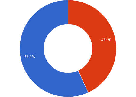
Update: By popular demand, I’ve taken a stab at adjusting the pricing comparisons to be in line with ticket usage from RTS Table 20. This is rather rough and ready, because Opal or Not does not collect the user’s actual ticket types or record non-optimal paper fares, but long story short, this shaves $44m off the paper advantage and converts 280k people into the Opal camp, meaning only 26.46% pay more with Opal. This, mind you, is still about 4x more than what TfNSW is claiming, and it goes to underline what we’ve seen from previously: those who win from Opal win a bit, while those who lose generally lose a lot.
The previous calculation is now Model A, and this version is now Model B.
10. Opal trip advantage not always applied
More specifically, the site does not cater to the case where there is less than 60 minutes between the trip out and the trip back. Again, since Opal or Not is a commute comparison tool and most people work/study more than 60 minutes a day, this scenario is irrelevant. No adjustment needed.
11. No provision for journeys with multiple transfers
Setting aside ferries, there are three possible realistic multiple transfer combinations: train/train/bus, bus/bus/train, bus/train/bus. The first and most common is already catered for, since Opal or Not can compute the fares between any two train stations, including transfers. For the second, Opal would be cheaper if you were currently foolish enough to purchase separate tickets, but as we know MyMulti is nearly always the better option even for a single bus/train transfer, much less two; not covering this thus tilts the balance in Opal’s favor.
So that leaves the third option, bus/train/bus. Getting good data on this is hard, but Bus Users in Sydney, 2002 p5 (not a typo, that’s the latest available) tells us only around 7% of bus journeys involve two buses, and Rail Travel Statistics 2012 section 3.2 tells us 17.7% of train users transfer to bus, from which we can determine a conservative upper bound of 1.2% travellers affected. Not that this helps Opal’s case any, as MyMulti will almost certainly wipe the floor with Opal for these poor people, but I’ll graciously not dock Opal’s score for this. In Opal’s favor.
12. Many NSW TrainLink Intercity stations not included
That’s because they were not covered by Opal at the time the service was launched, although support has since been added both to Opal and Opal or Not. Once again, if you can’t compare it you can’t get it wrong, so no impact on accuracy.
14. $2.50 Sunday cap not included
Neither Opal’s all-day-for-$2.50 offer nor the more limited Family Fun Day ticket it replaces is covered by Opal or Not. While this is clearly a win in Opal’s column, for the vast majority of Sydney’s commuters it’s a nice bonus, not an actual commute cost-saver.
The second complication is that since the Travel Reward is accounted for, this applies to only people who travel on Sundays without accruing 8 weekday journeys. Since Opal or Not does not ask about days of week, and I’m not aware of any TfNSW data for this, quantifying the size of this group is difficult.
All in all, no adjustment made, but underlying bias is in paper tickets’ favor.
13. Domestic Airport and International Airport stations not included
15. Opal Child/Youth fares not included
16. Opal Senior/Pensioner fares not included
Opal or Not is a weekly commute calculator, all these are explicitly out of scope and do not affect the accuracy of results. No adjustment needed.
17. Daily tickets not included
The Opal $15 daily cap is included in the site; however, the $23 MyMulti day ticket is not. This skews the results in Opal’s favor.
18. Fares for services and classes of Opal cards that have not yet been announced
I had to read this one twice: TfNSW apparently considers it a flaw that Opal or Not does not cover Opal fares that have not yet been announced? I’ll be happy to address this once somebody lends me a time machine. No adjustment needed.
We’re done! Almost, anyway, since magnanimous soul that I am, I’m going to include a large source of error that TfNSW did not notice:
Bonus. Off-peak fares on trains
Off-peak fares are frequently cited as a major win for Opal, and while Opal or Not now supports them, this option was not available initially, affecting the first 26,925 comparisons. Looking at the additional statistics kept for off-peak fares, we can see three general trends:
- The 15% of train travellers who travel outside both peak periods are unequivocal winners, Opal saving them around $200/year.
- The 20% who have one peak and one off-peak trip come out a wash, gaining or losing less than $100/year.
- The 65% who hit both peak periods pay on average $270/year more.
So while the majority still lose, the gains of the small group of winners are so large that they translate to a 30% decrease in the overall cost. Adjusting the data accordingly (see spreadsheet), this docks some $14 million off paper’s advantage. Better start waking up before 7 AM!
Conclusion
 Of the 20 potential issues identified by TfNSW and yours truly:
- 4 bias the results in paper tickets’ favor, and are accounted for by adjusting down by $20m,
- 3 bias the results in Opal’s favor, which means Opal’s actually even costlier than this report indicates, and
- 13 have no measurable impact.
In other words, this report bends over backwards to give Opal the benefit of the doubt, and it still comes up a cropper to the tune of $54 to 98 million dollars.
Call to action
So what should Transport for NSW do to fix Opal? I have two simple suggestions:
- Allow bus, train and ferry transfers. A wide array of wise men all agree: if Melbourne, Perth, Brisbane and Adelaide can all do it, there’s no sane reason why Sydney can’t. Penalizing modal transfers makes Opal a huge leap backwards for Sydney transport.
- Lower the base fare and drop the Travel Reward. The “Travel Reward” is supposed to encourage using public transport, but it ends up discouraging it for many people, and only encourages gaming the system instead.
If you agree, let the Minister for Transport know. Gladys, the buck stops with you here: it’s not too late to fix this, and turning Opal from a PR disaster into a win for your Sydney voters will only take a stroke of your pen.
And if you’re a commuter who wants to hedge your bets, lock in your savings before Opalcalypse on September 1st, 2014, and buy a quarterly or yearly ticket today.

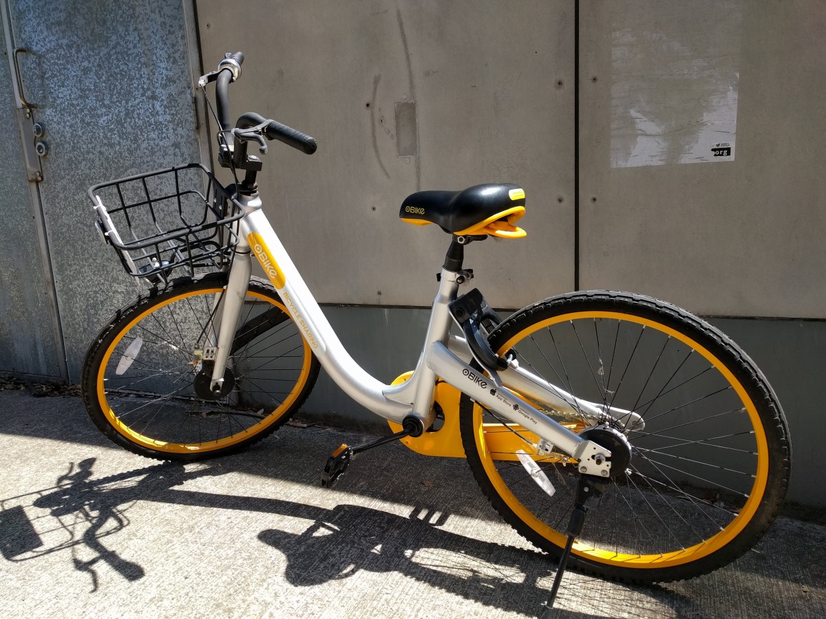
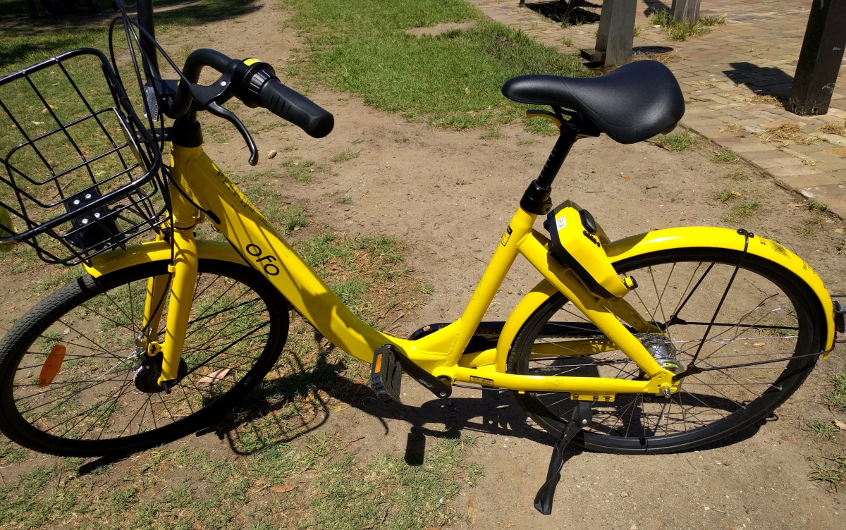
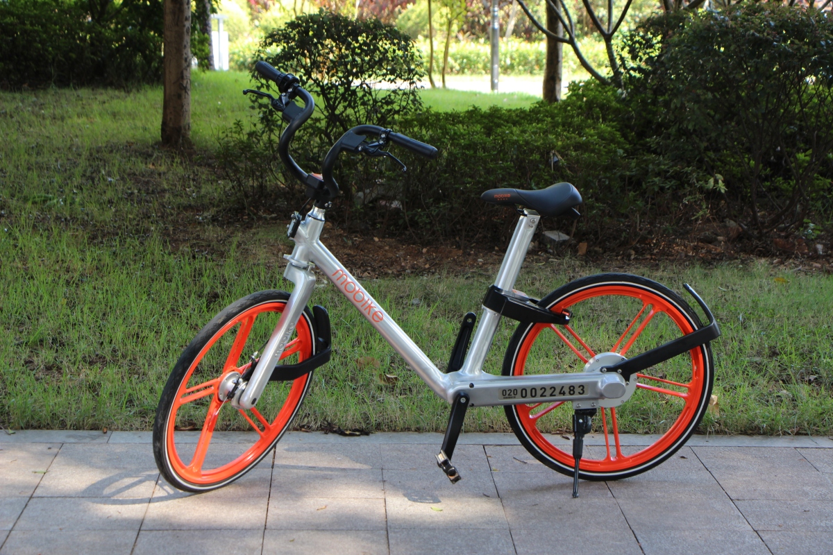
 The first reason is simple: they’re the only ones still trying. In the last few weeks, not only has a fresh flood of Mobikes hit the streets, but some of them are the next-generation Mobike Lite 2nd gen bikes that are much lighter than the old ones and have seat height adjustable up to 180 cm, making them so much more pleasant to ride. Still no gears, and they feel a lot flimsier since they have a normal, exposed chain transmission instead of the Heavy’s fully encased shaft, so it remains to be seen how they’ll stand up to the mean streets of Sydney, but all in all they’re now almost as good as Ofo bikes used to be. By comparison, what was the last time you saw a new Ofo or Obike?
 Last but not least, Mobike is the only one still restocking helmets: here’s a recent shot of 6 Mobikes in a row, where every single one has a helmet. (Although I’ll admit this was more like winning the lottery than a daily sight.) Given that the boys in blue are actually enforcing the law every now and then, meaning you risk a stonking $319 fine if caught without one, you’re a fool to bike without a helmet — and good luck finding one that’s not orange.
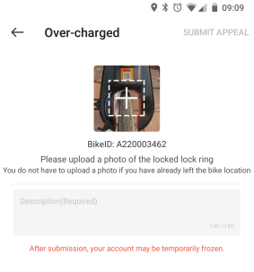 App (♥♥♥): For a long time Mobike’s app scored a solid zero, because it would crash every time I tried to open it. They finally fixed that glitch a few weeks ago, and now it’s mostly usable. Unlocking is flaky, but whereas Obikes flake out and refuse to physically unlock, Mobike will release the lock bar on the bike and the app will then tell you “unlocking failed”. Free ride for the win? At the end, after you lock, the app will first tell you off for “Over-charged” and threaten to freeze your account, only to suddenly remember that you’re in free trial and everything’s actually copacetic.
 Dockless bike sharing may be a killer app, but NSW’s absurd helmet laws are the killer app killer. In addition to the “yuck” factor of sharing headgear with random strangers, it’s getting really difficult to find a bike of your preferred brand that has a helmet attached. While quite many people choose to ride without one, the prospect of a $330 fine is going to deter a lot more people. It’s a huge logistical challenge for bike share companies too: even when bought in bulk, the cost of delivering helmets alone will destroy profit margins, no matter how indestructible the bike.
 So I was walking along one day when I was suddenly accosted by a Canadian Mountie in full uniform: red jacket, jaunty hat, the works. He saluted me smartly and asked: “How about some
  “But aren’t those big blocks mostly useless frozen tundra?”
 But right after I left the bank I was accosted again, this time by a disheveled hippie in a poncho. “Hola, dude. Can I give you some awesome
  The hippie shuffled uncomfortably. “Well, these soles, they are real money, but they are hard to use outside Peru. We want to make soles a strong world currency, like the U.S. dollar.”
 This little parable is, of course, patently ridiculous. Nevertheless, ridiculous or not, it’s also exactly what’s happening in the weird world of alternative cryptocurrencies (altcoins).
 Investors in Monaco become holders of Monaco Card Tokens (MCO). Monaco promises these investors exactly one source of revenue: a flat 1% licensing fee on all debit card transactions paid with cryptocurrencies, which is converted into ETH immediately and added to a pool called the Asset Contract. This also means that any transactions made using Monaco but funded by fiat, which in Monaco’s own opinion will account for 60% of transactions in the first year, will net investors precisely nothing.
 So that’s the deal for investors. How about ordinary users who just want to use the card to realize those great 6-8% savings?


 Back in reality, Japan is simultaneously embarking on the equally mammoth task of