The backstory behind Opal or Not.
Last year, Sydney started trialing its new “Opal” transit smartcard. As a regular commuter on Sydney Ferries, the first service to roll out Opal, I awaited its arrival eagerly. After all, they couldn’t possibly screw it up worse than Melbourne’s Myki, whose ludicrous cost overruns and sheer technical incompetence I had witnessed first hand earlier.

Alas, while Opal has indeed been lighter on the government’s purse and is mostly capable of registering card taps, Transport for NSW still managed to completely stuff up something that Melbourne didn’t: the fare structure. For many users including me, Opal is much more expensive, in my case translating to $332.80 more every year for the same commute.

Virtually every smart card in the world prices individual trips lower than the equivalent single fare, meaning it always make financial sense to use the card. Not Opal: for ferries and buses, a single fare costs more than a trip on the TravelTen paper ticket, and only on your 10th trip of the week does the cap finally make Opal cheaper again. And if, like me, you occasionally bike to work or work from home, meaning you use the ferry or bus less than 10 times a week? You fall into the Opal Fail Zone, shown in red above: that’s the premium you pay for the privilege of using Opal.

But believe it or not, I soon found out that there were others even worse off than me. Say you live in Dee Why, take a bus to Wynyard, and switch to the train to Central. (Substitute with bus/train combo of your choice.) Because Opal has no replacement for MyMulti, your commute is going to rocket up $728 a year, even if you travel five days a week!
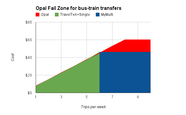
Just look at that thick red slab of Opal Fail: if you’re commuting by bus and train, unless you’re doing it exactly 6 times a week, it never makes sense to switch to Opal.
Is it easy to figure this out? Hell no, it takes an intimate understanding of Sydney’s convoluted fare structure and a whole lot of flipping between browser tabs to come up with the actual numbers. The Opal website has some contrived examples, every single one of which shows Opal as cheaper, but lacks even a basic Opal fare calculator, never mind any way to compare to non-Opal fares.
Now I could have written feedback to Opal, which would have gotten me a form letter response with sneering thanks before getting chucked in the bin. Or I could have written an angry blog post (well, I am writing one), which with some luck would have been retweeted a few times before being overtaken by Justin Bieber’s latest drunken antics. But neither would have had any real impact.
 Instead, I wanted something that would:
- Let people see exactly how the switch to Opal will hit their wallet
- Collect statistics on how many people are positively or negatively impacted by Opal, and by how much
- Ultimately make Transport for NSW to come up with a saner fare scheme that encourages all public transport use and does not penalize transfers.
So I spent a few evenings coding up a fare calculation engine (and Jesus Christ that was a pain, just look at this shit) and a few more slapping a web interface on top, and the result is Opal or Not. Here’s hoping it was worth it!
